The Solution
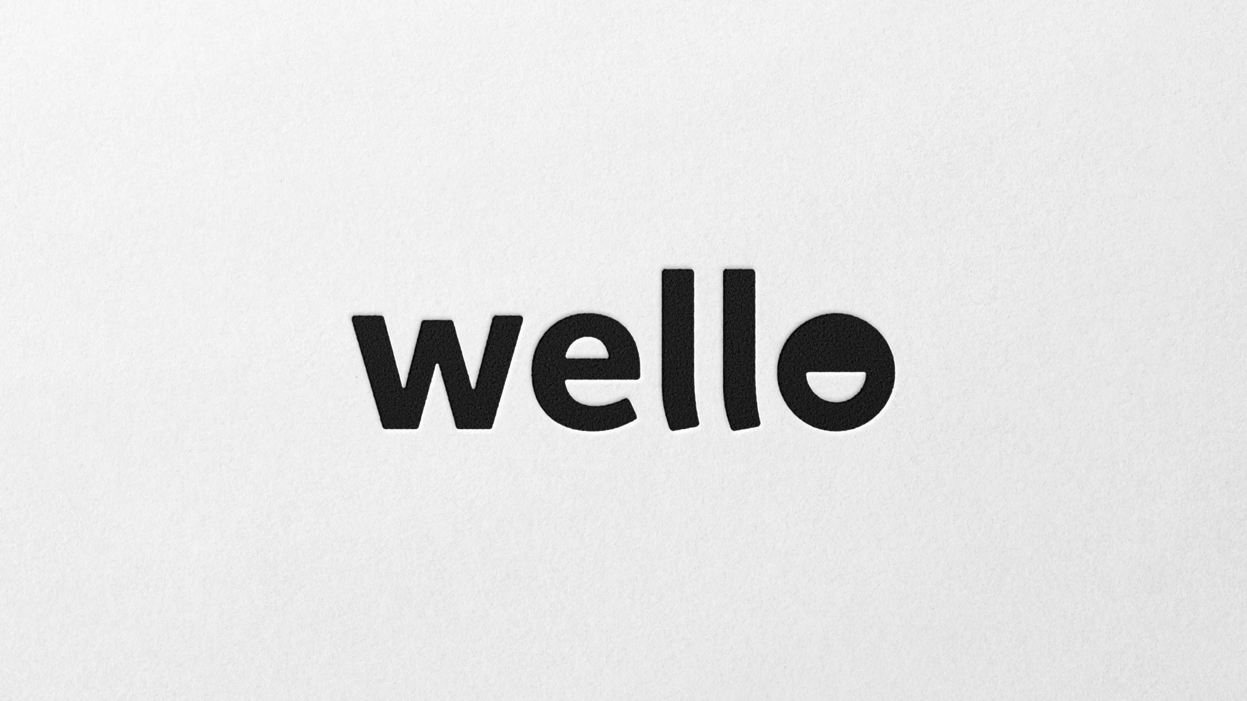
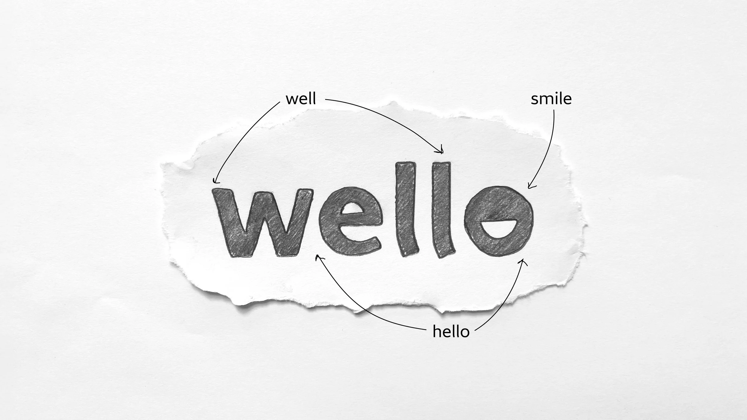
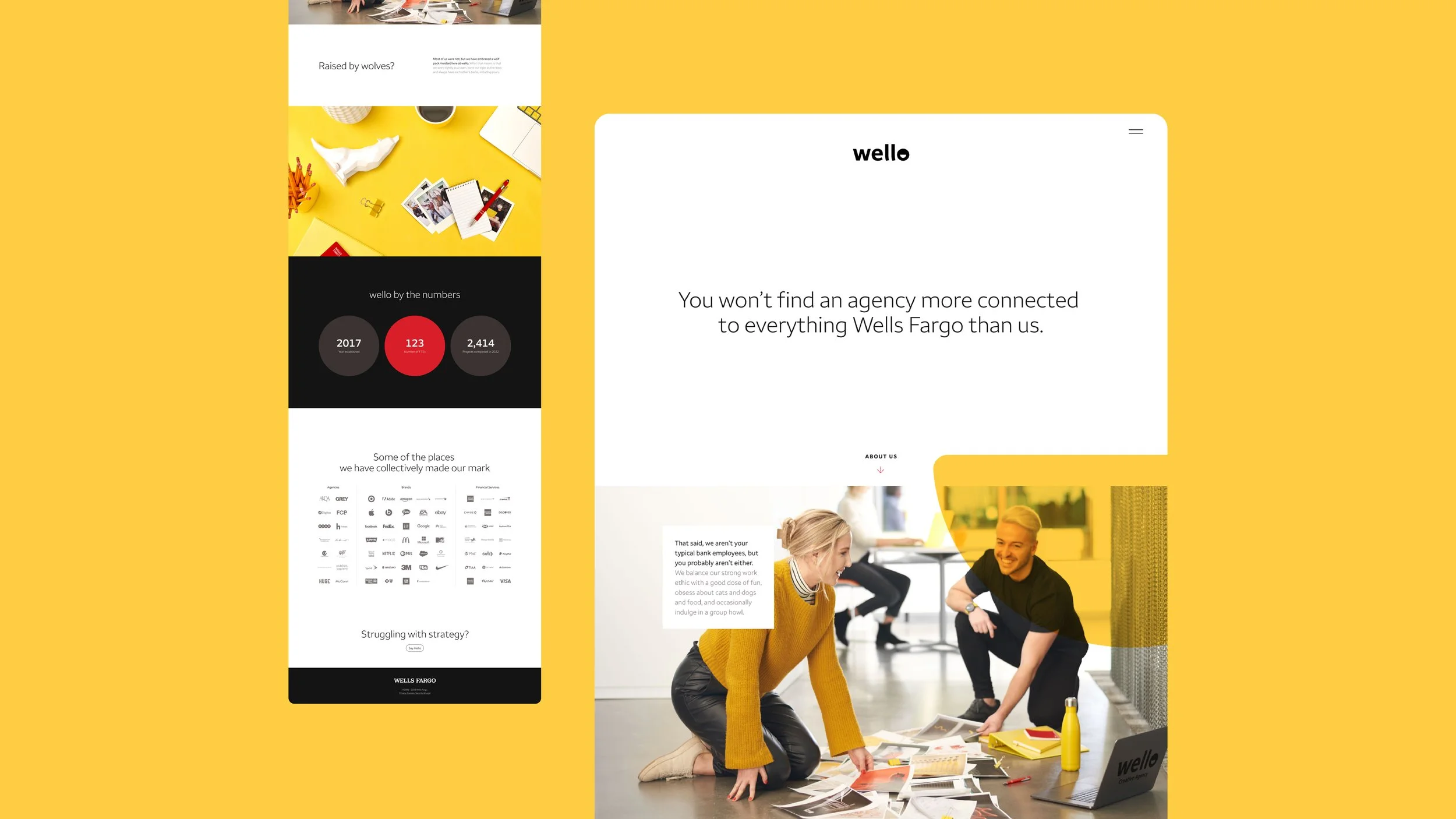
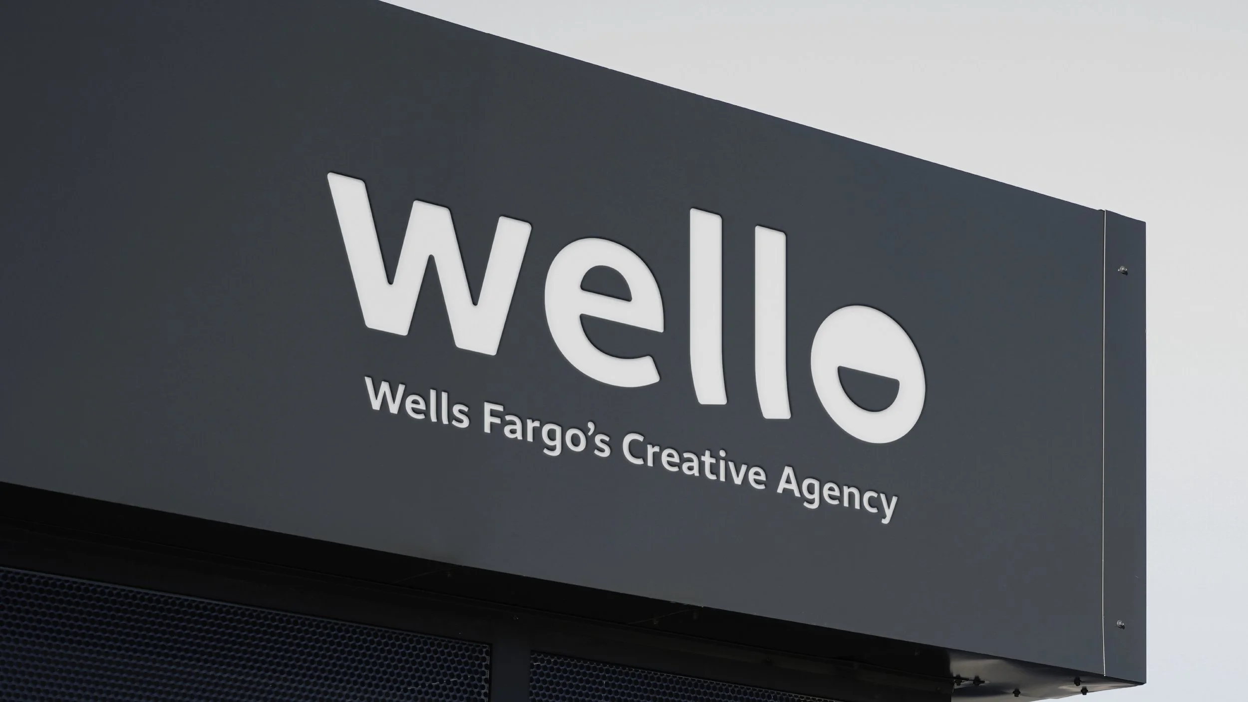
After rounds of brainstorming, we landed on Wello—a friendly blend of "Well" and "Hello," as well as a subtle nod to "Wells Fargo." The name felt approachable, creative, and gave the agency its own personality.
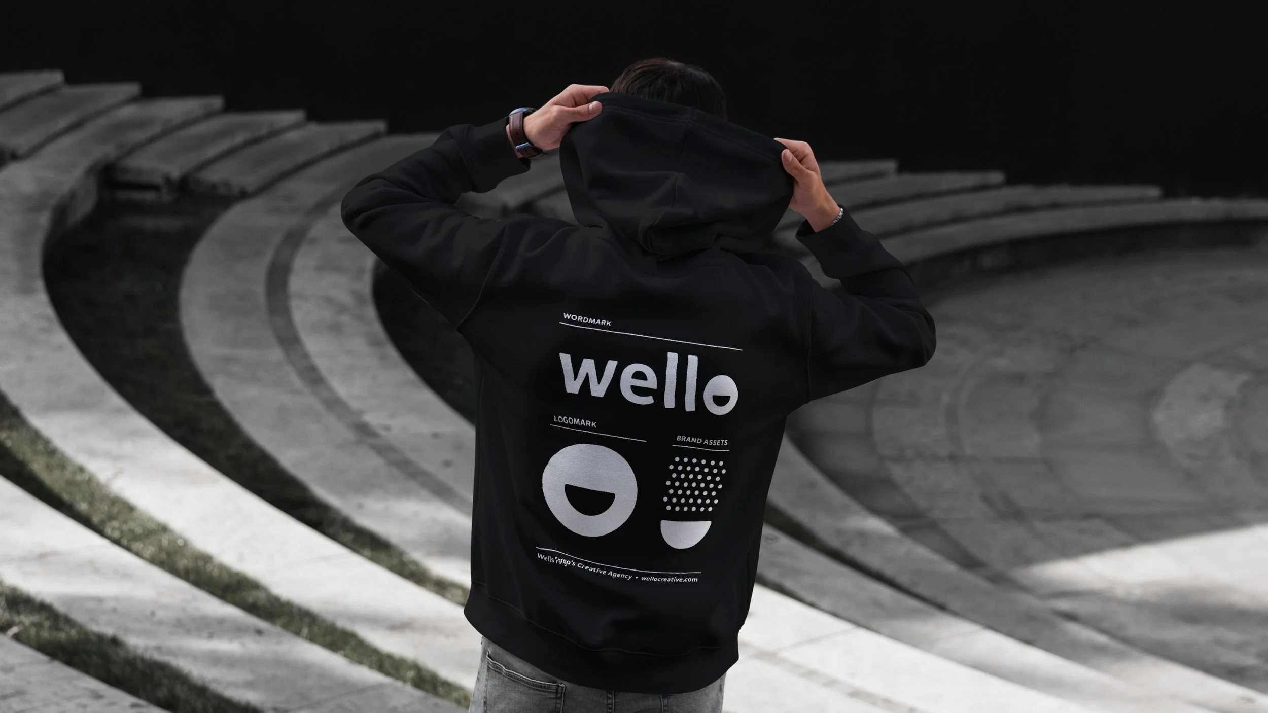
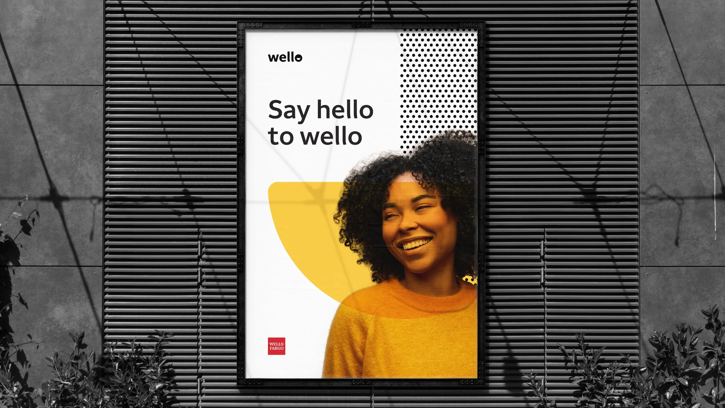
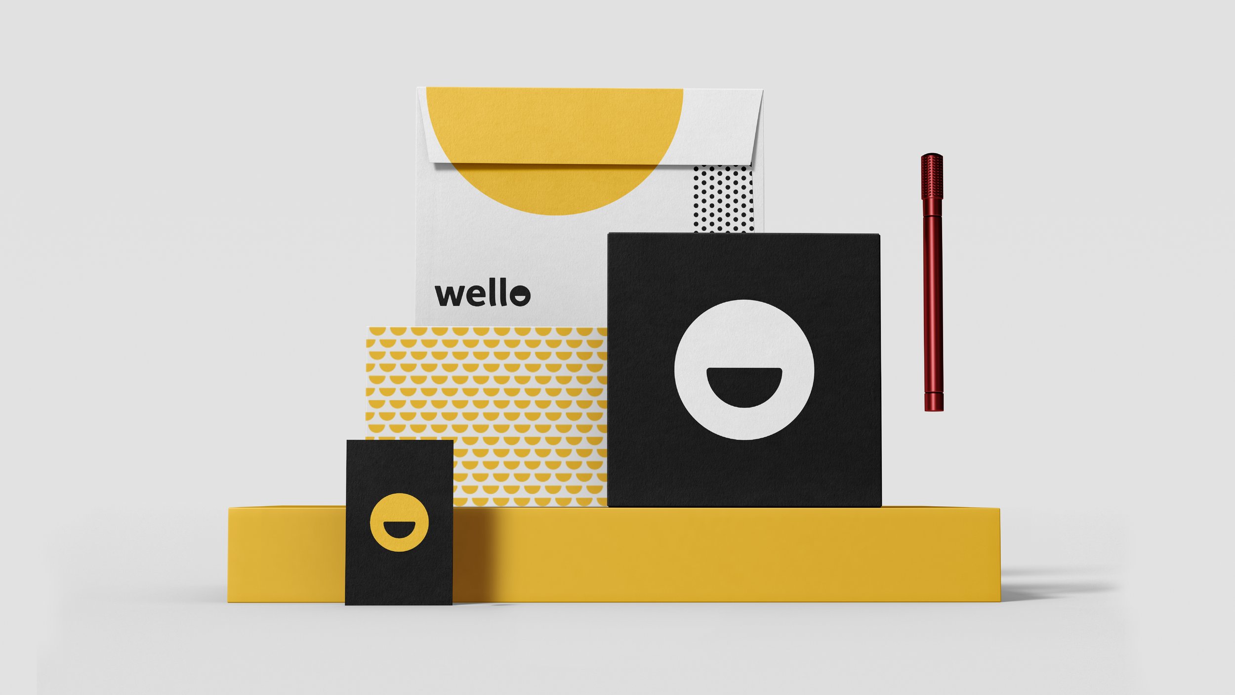
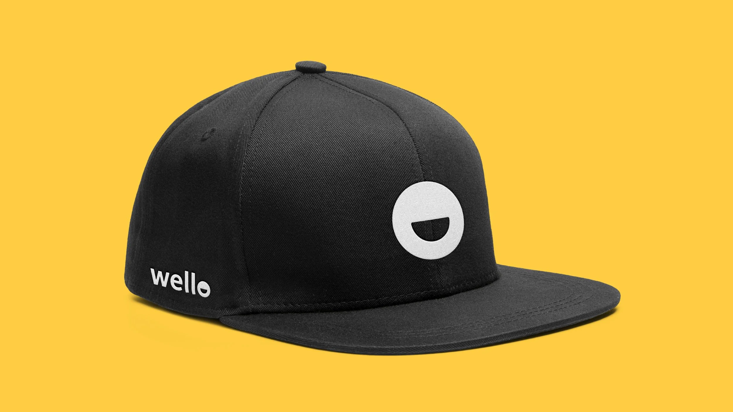
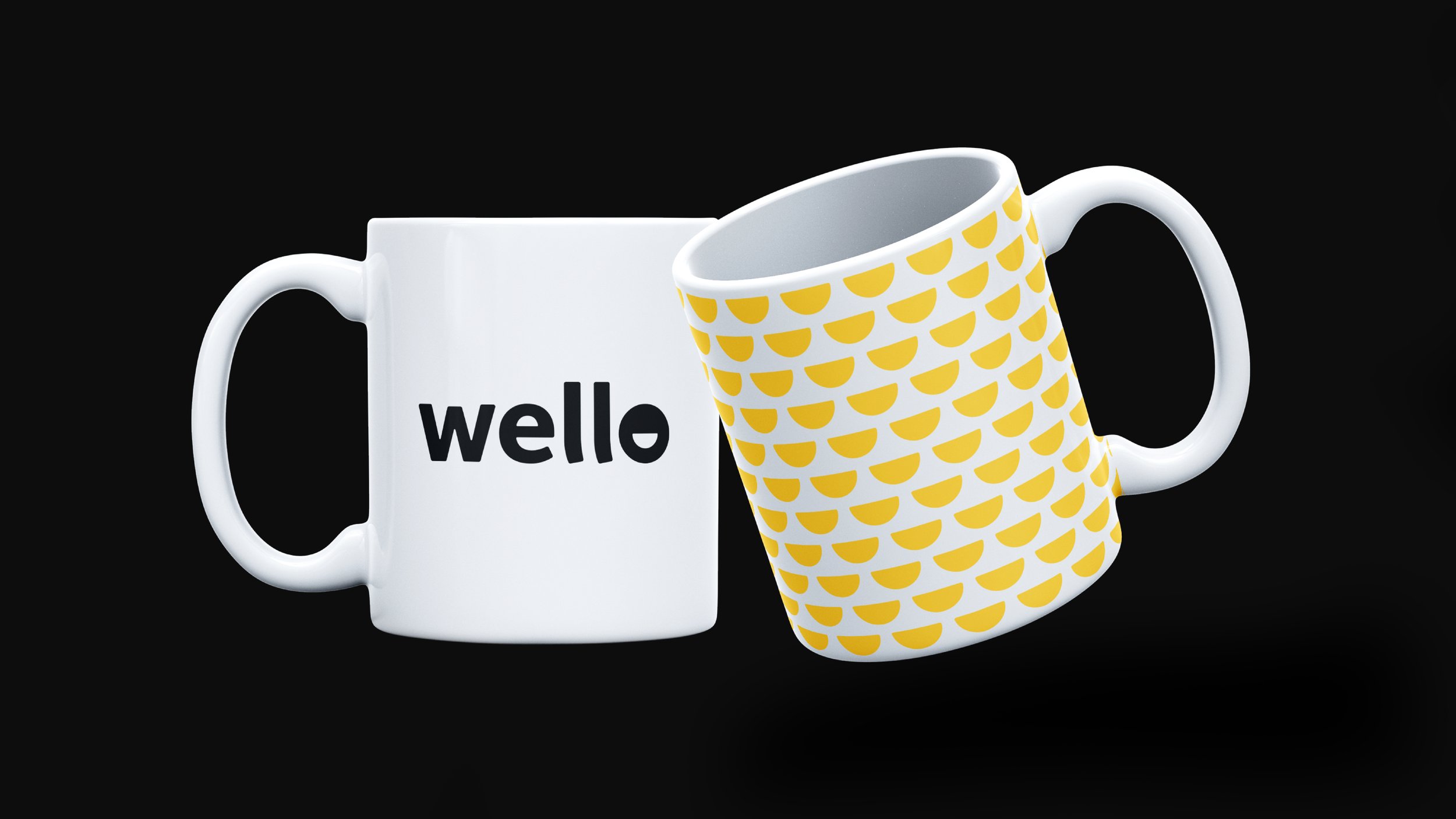
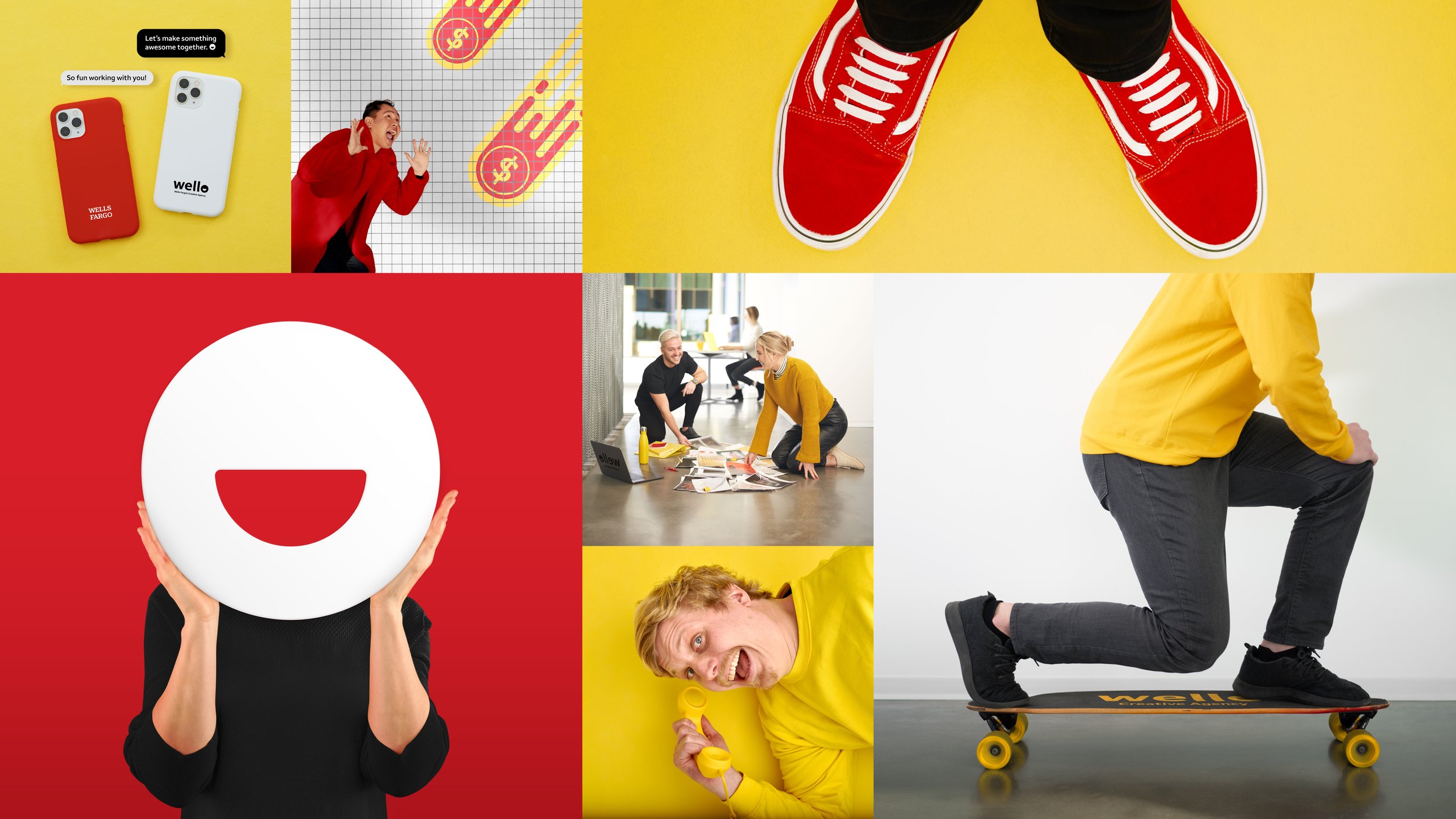
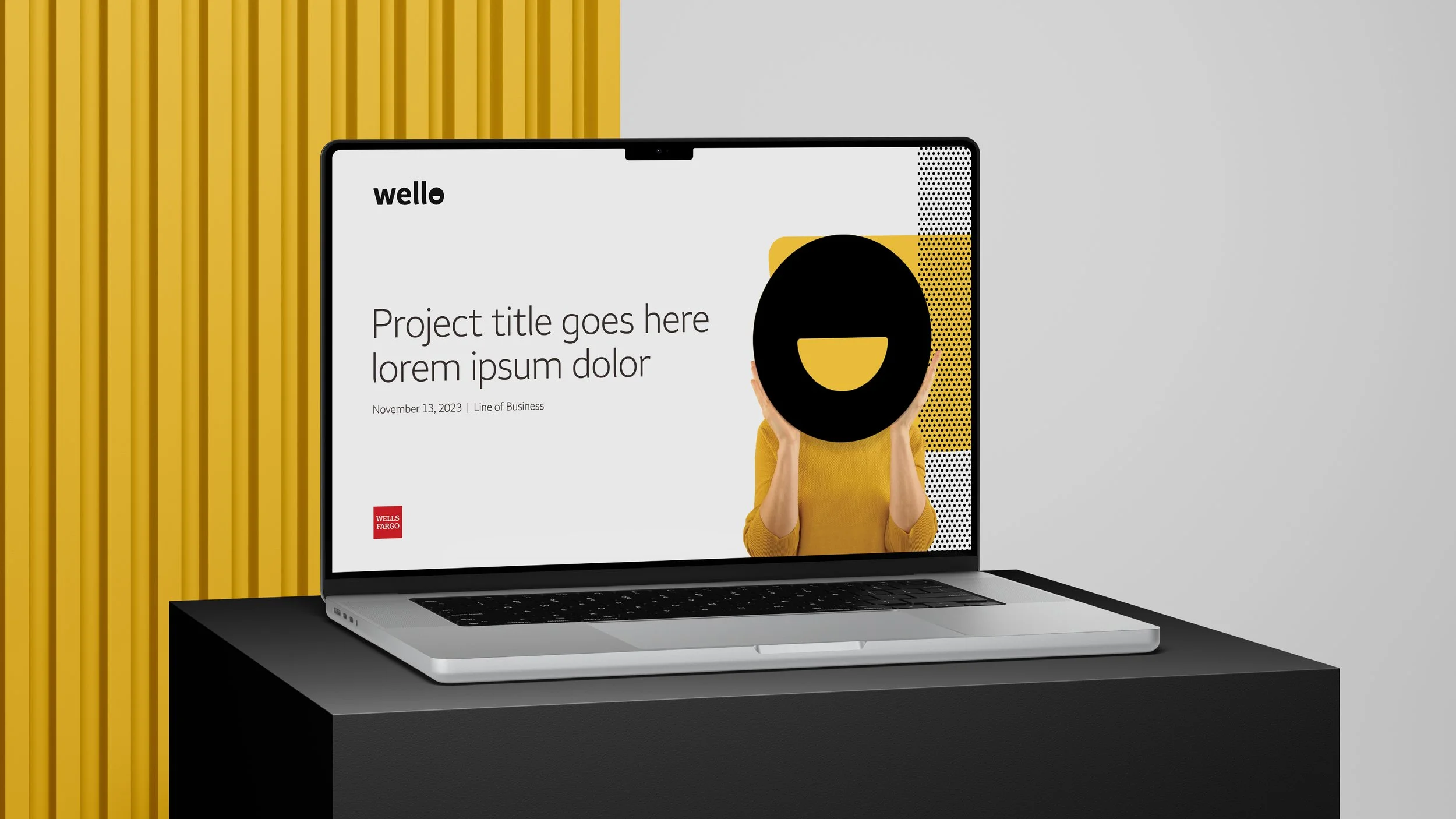
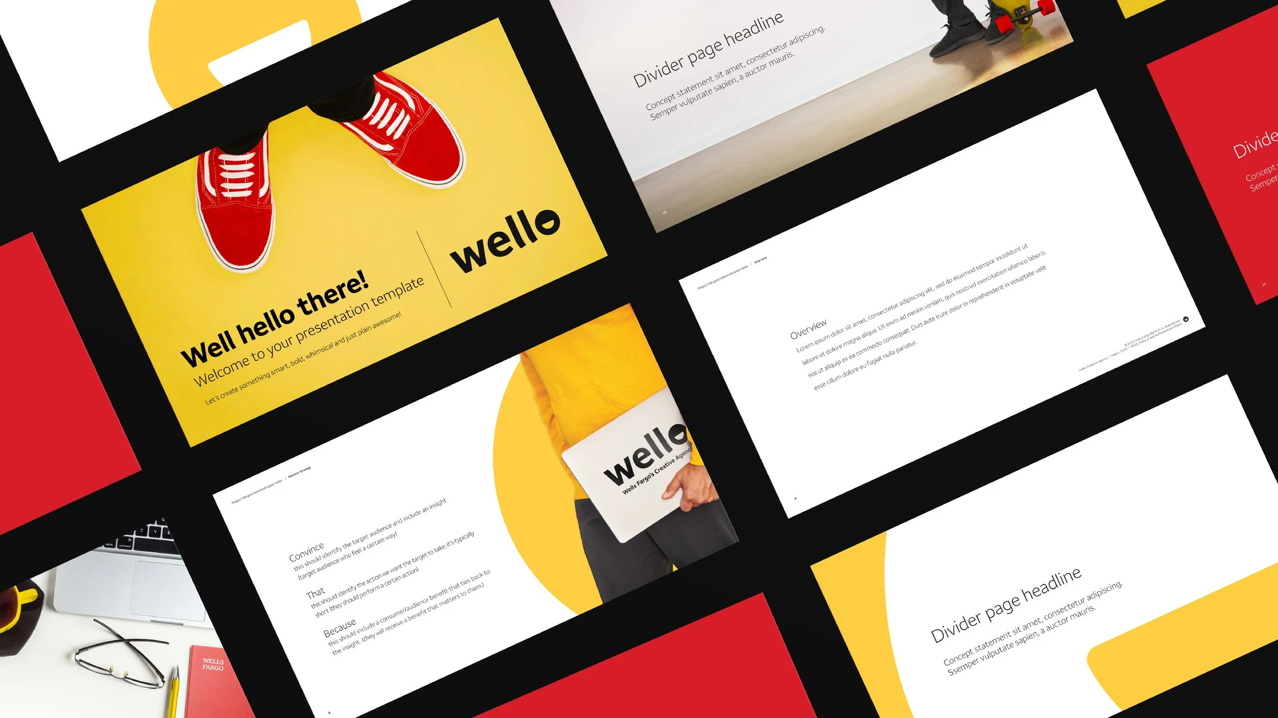
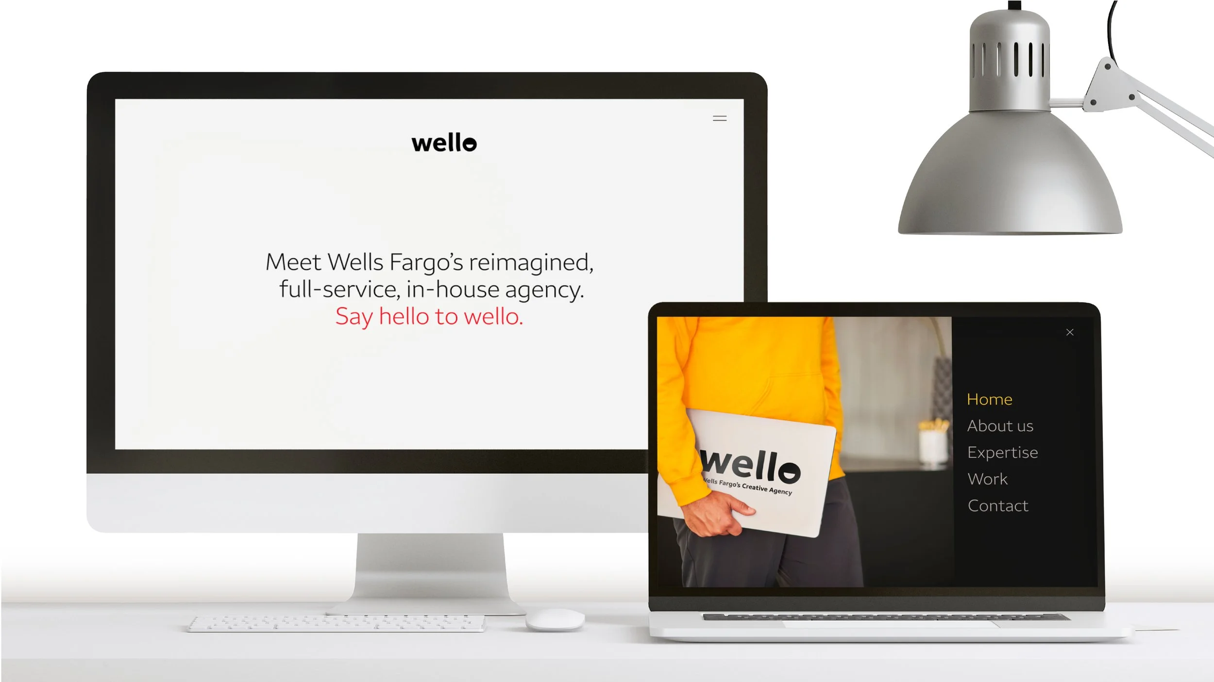
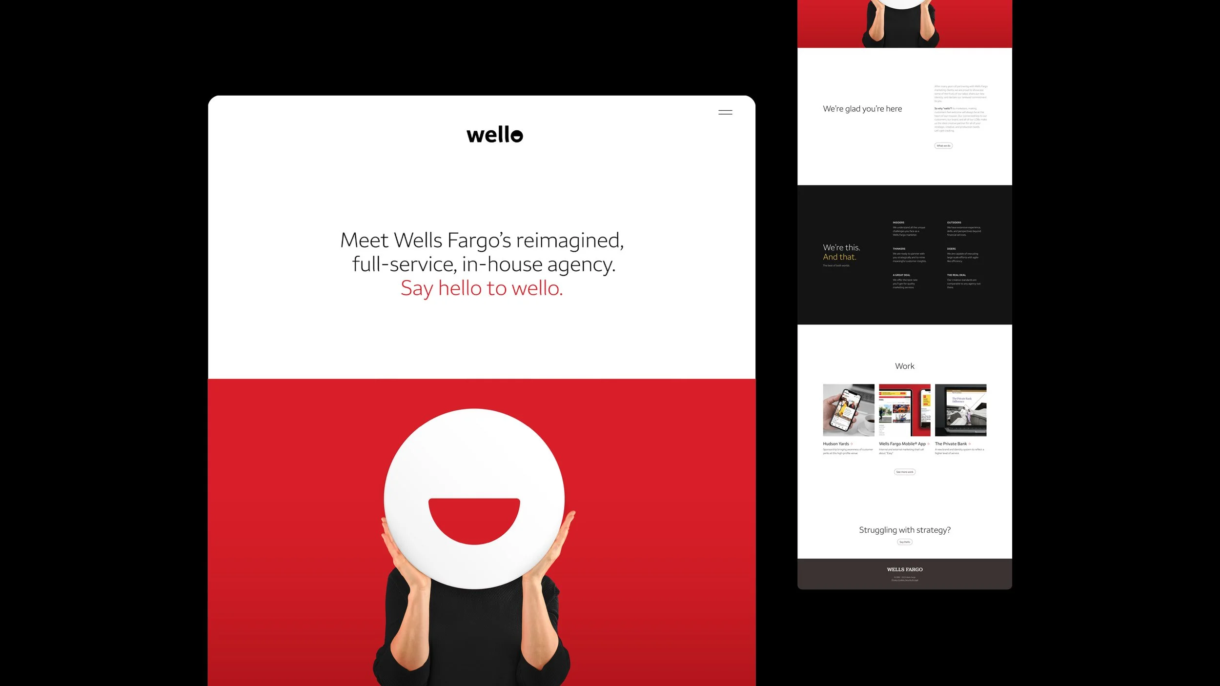
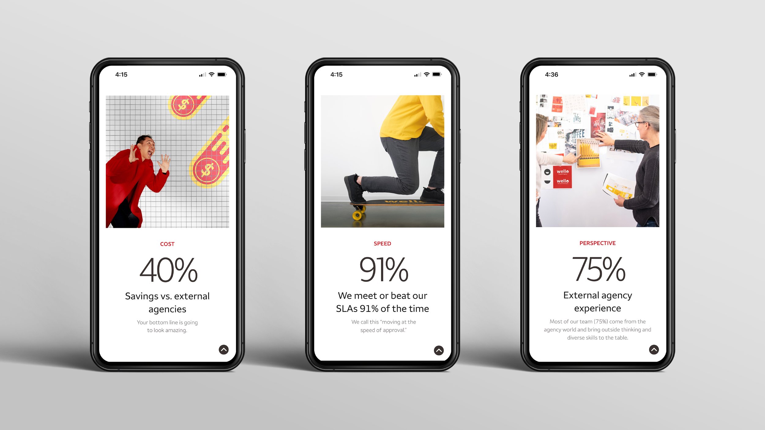
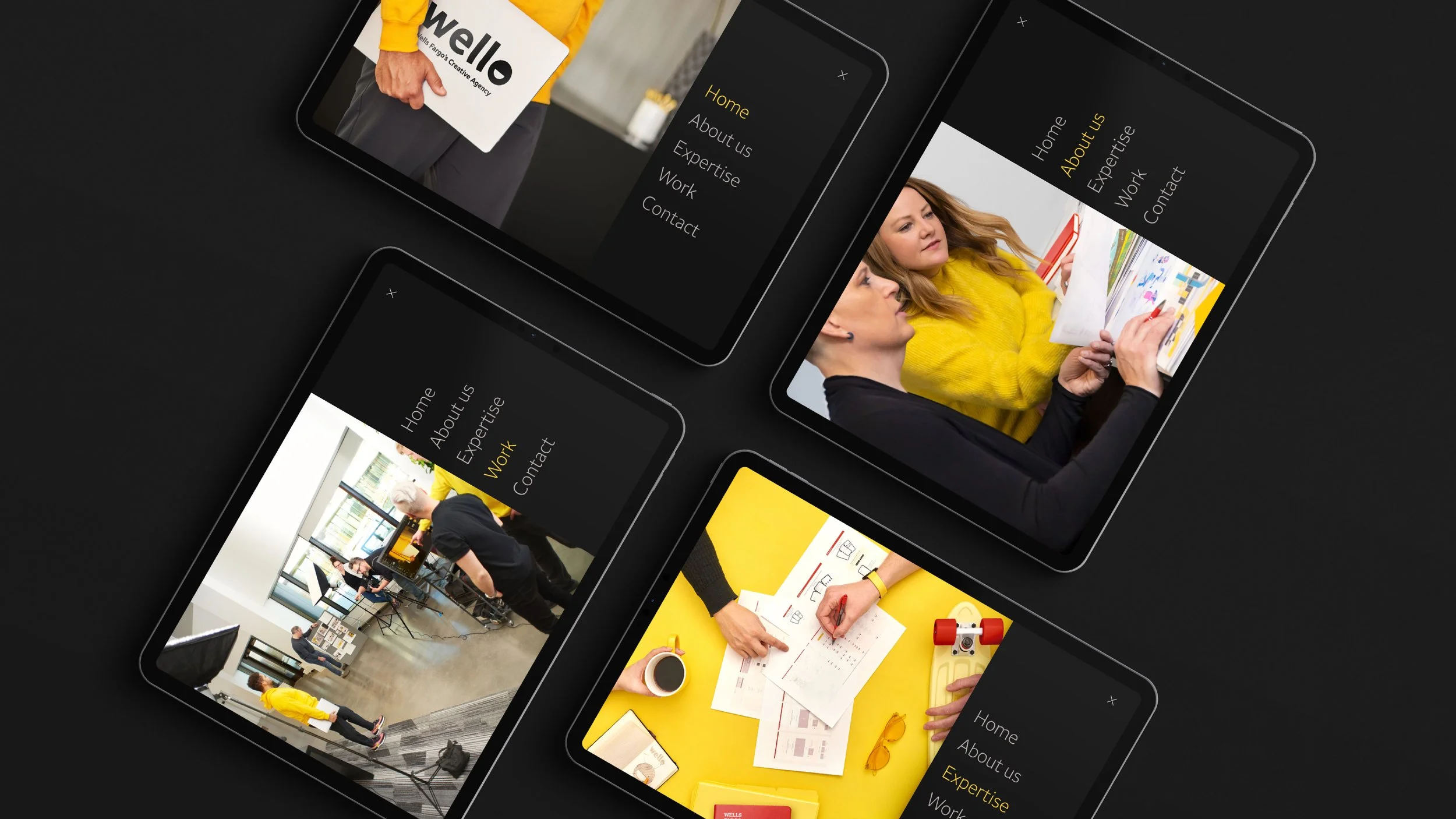
With the name in place, I moved to visual identity. I developed a clean, clever logotype that seamlessly incorporated a smile into the design—a simple but powerful way to reflect Wello’s welcoming and innovative spirit. That smile became more than just a logo element; it evolved into a core brand motif, appearing throughout the system in ways that reinforced connection and positivity.
When presented, the response was immediate: people loved it. It was fresh, it was memorable, and most importantly, it worked. Of course, no project of this scale happens in isolation—I had an incredible, talented team behind me, helping bring the vision to life across every brand asset.
This was more than just a rebrand; it was a transformation of how the agency saw itself. And being at the heart of that shift—Truly an unforgettable experience.

