The Solution
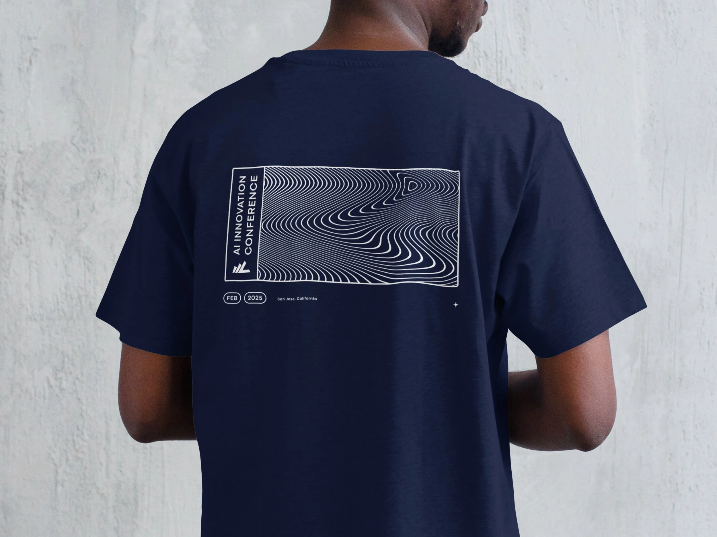
I built a consistent visual system that tied everything together, ensuring the event felt polished and unified. Grainy gradients became the main visual component, representing pixels and the digital nature of AI. From signage to ID badges (which I color-coded for easy attendee identification), every detail was considered. One of my favorite pieces? The conference shirt. I took elements from Linqto’s existing brand system and reworked them in a fresh way, creating a graphic that extended across various assets, giving the event a distinct but familiar feel.
What started as a small project became an expansive and dynamic brand experience—one that made the event as visually engaging as the ideas being shared.


