The Solution
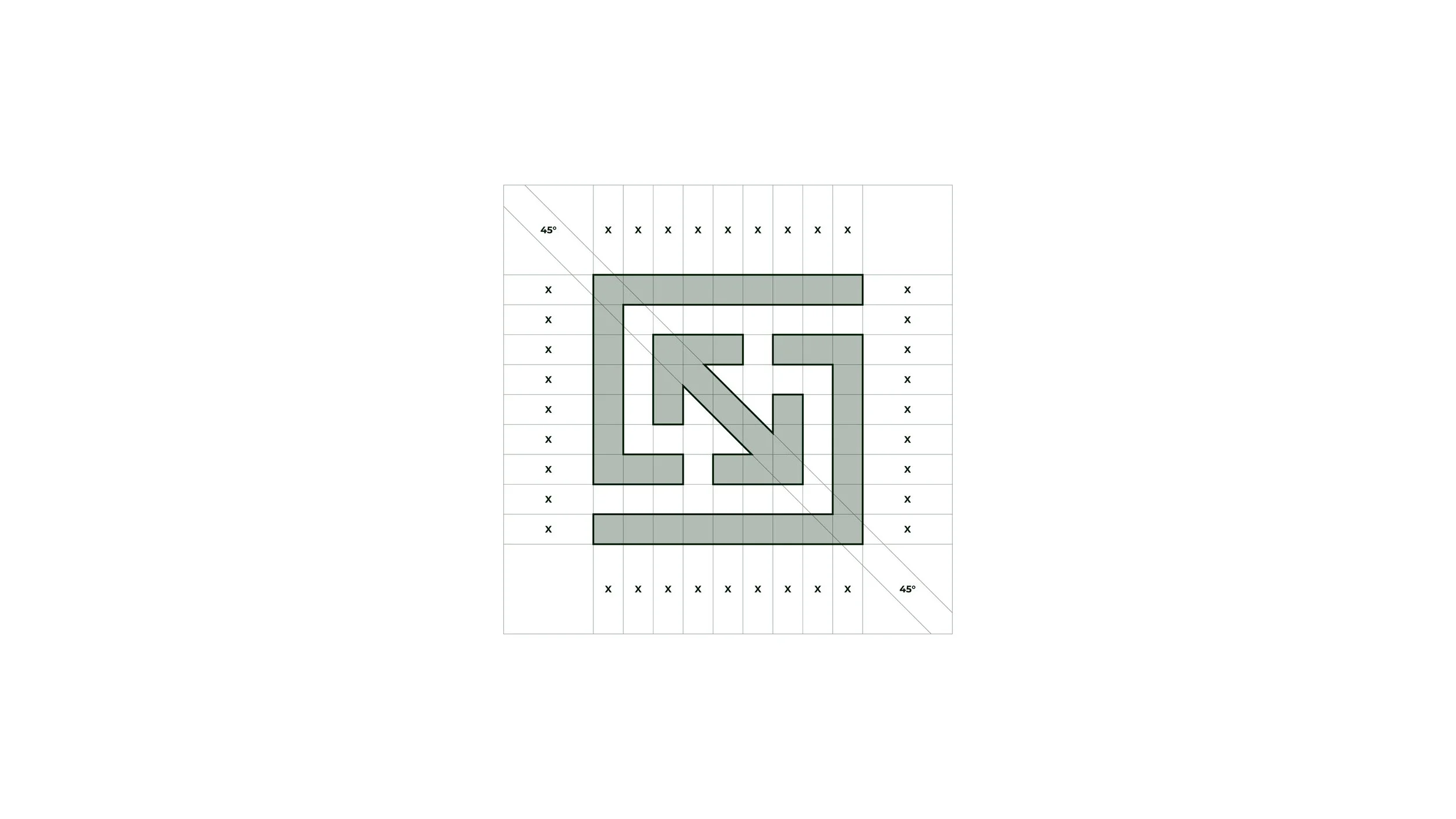
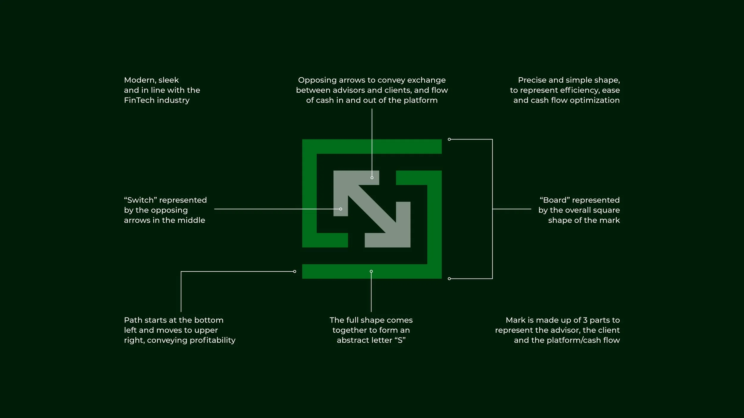
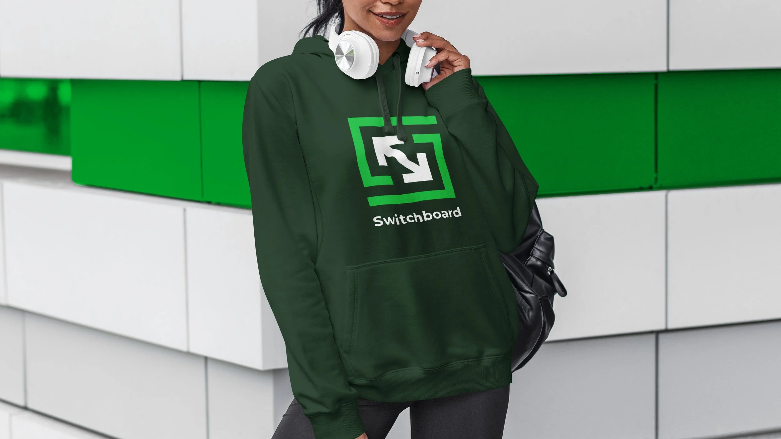
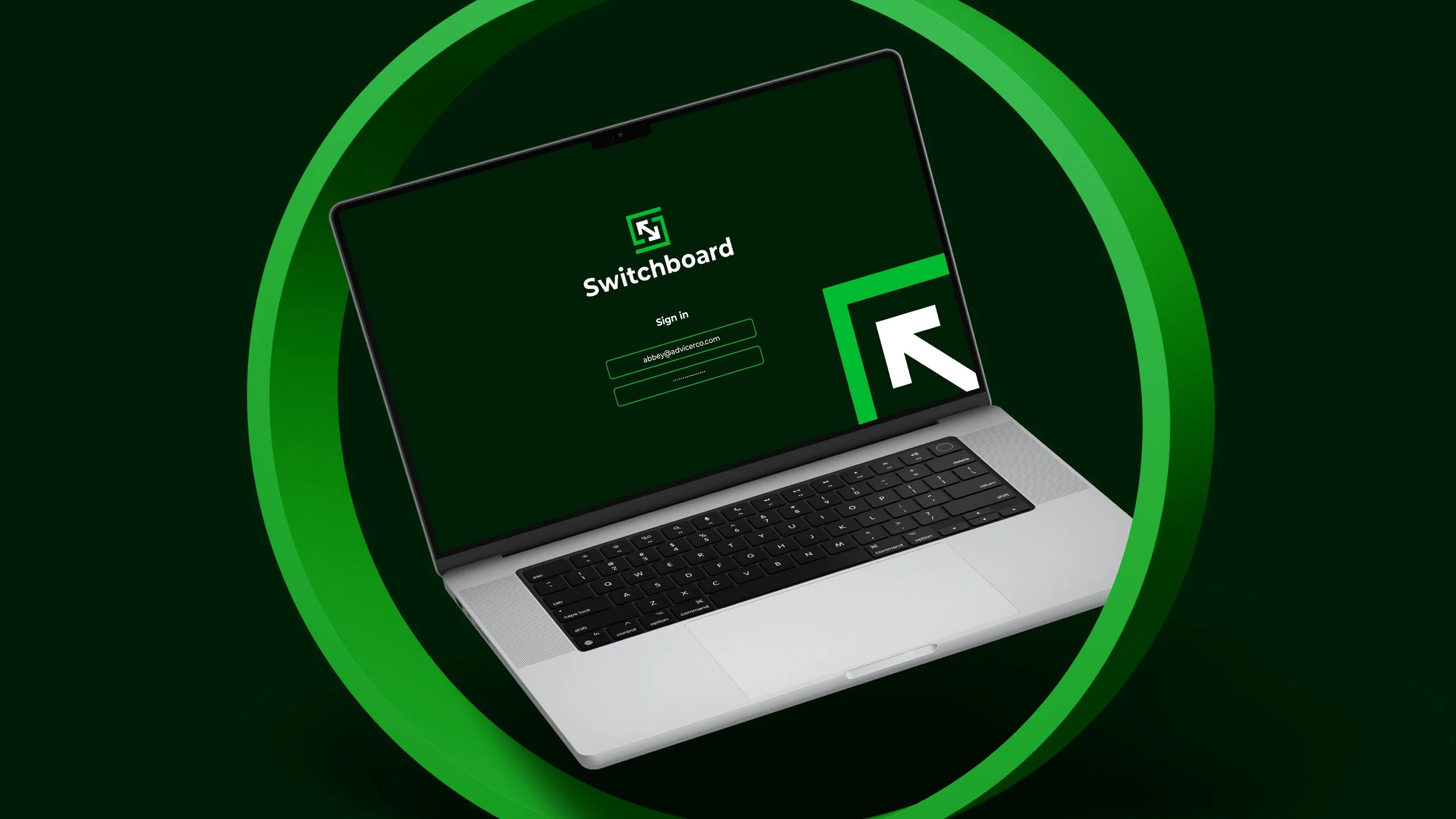
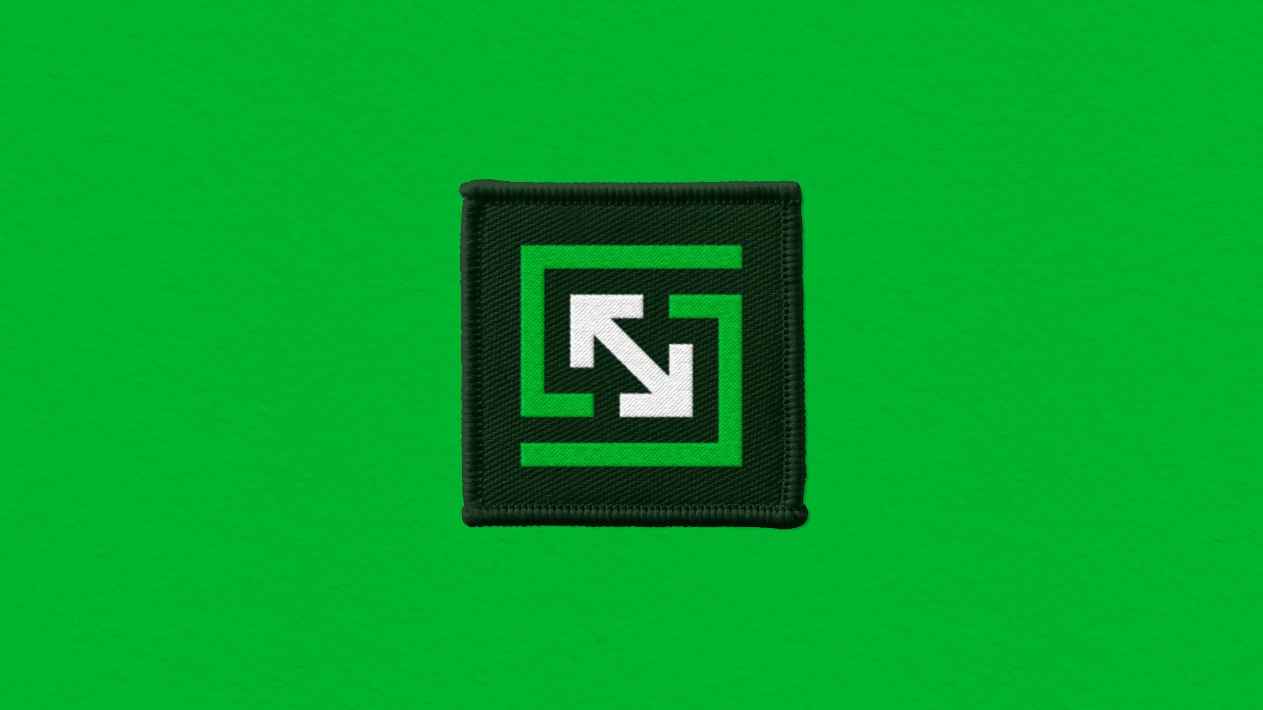
With my experience in fintech, I knew the identity had to be both minimal and intentional. I developed a sharp, fintech-ready logomark built from three elements—one representing the client, one for the advisor, and arrows symbolizing cash flow between them.
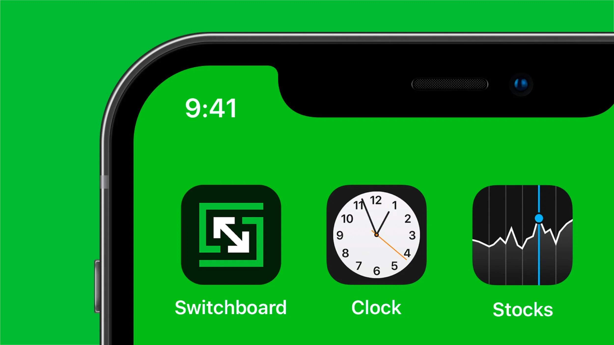
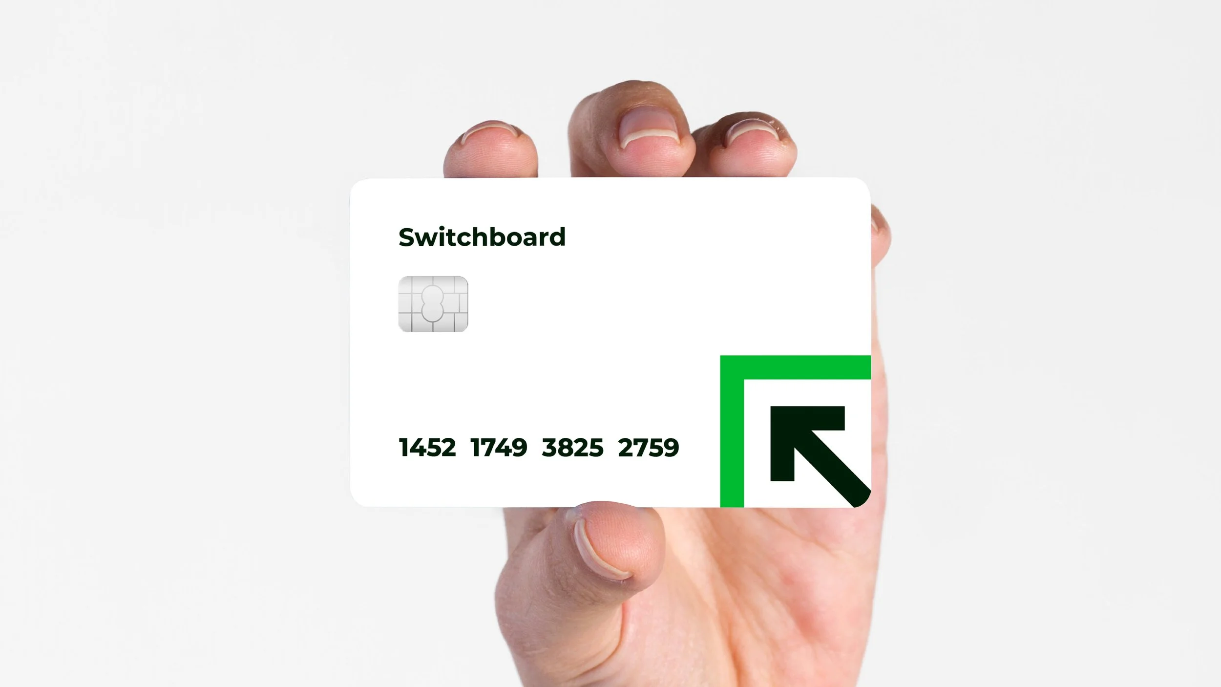
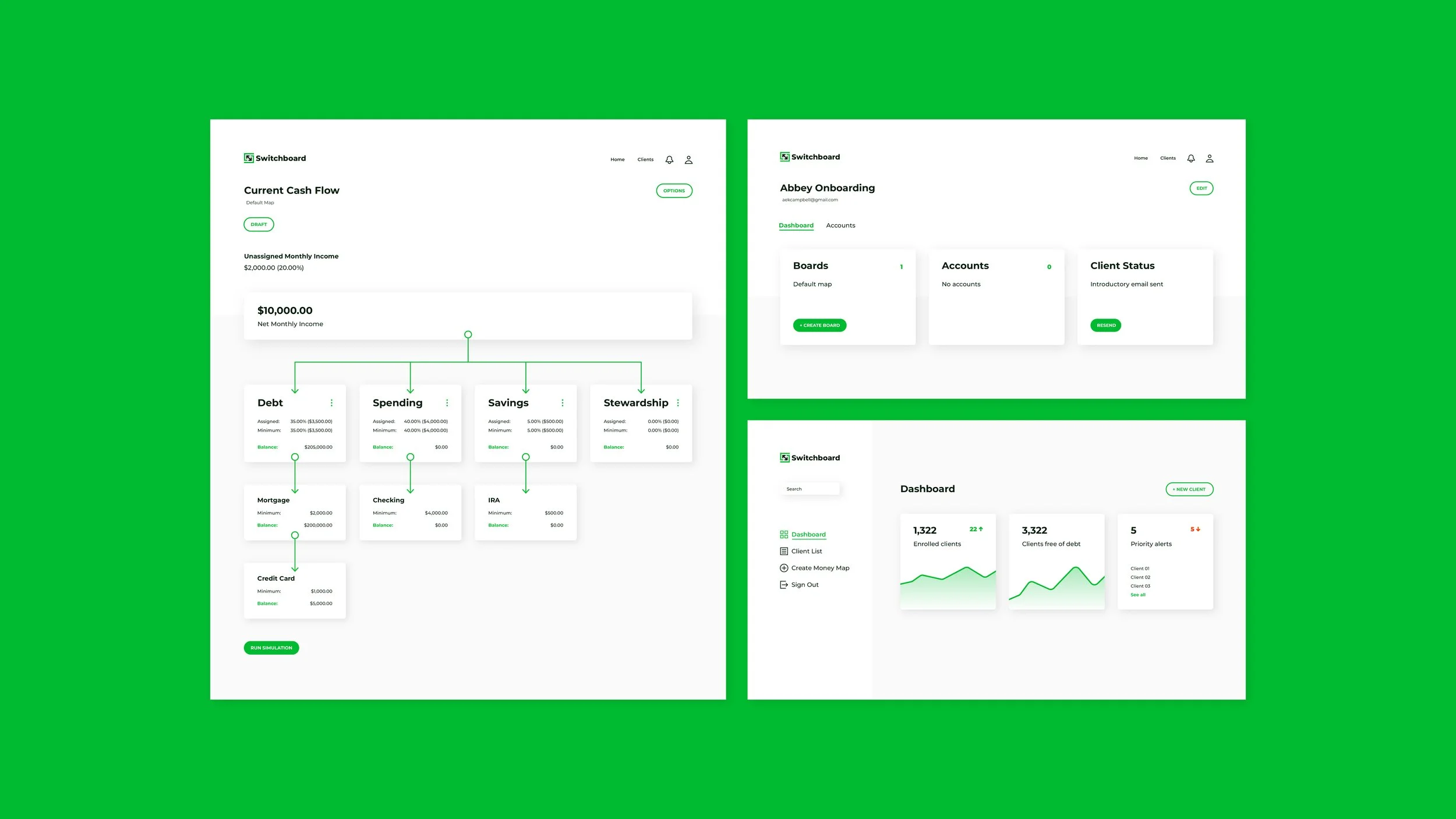
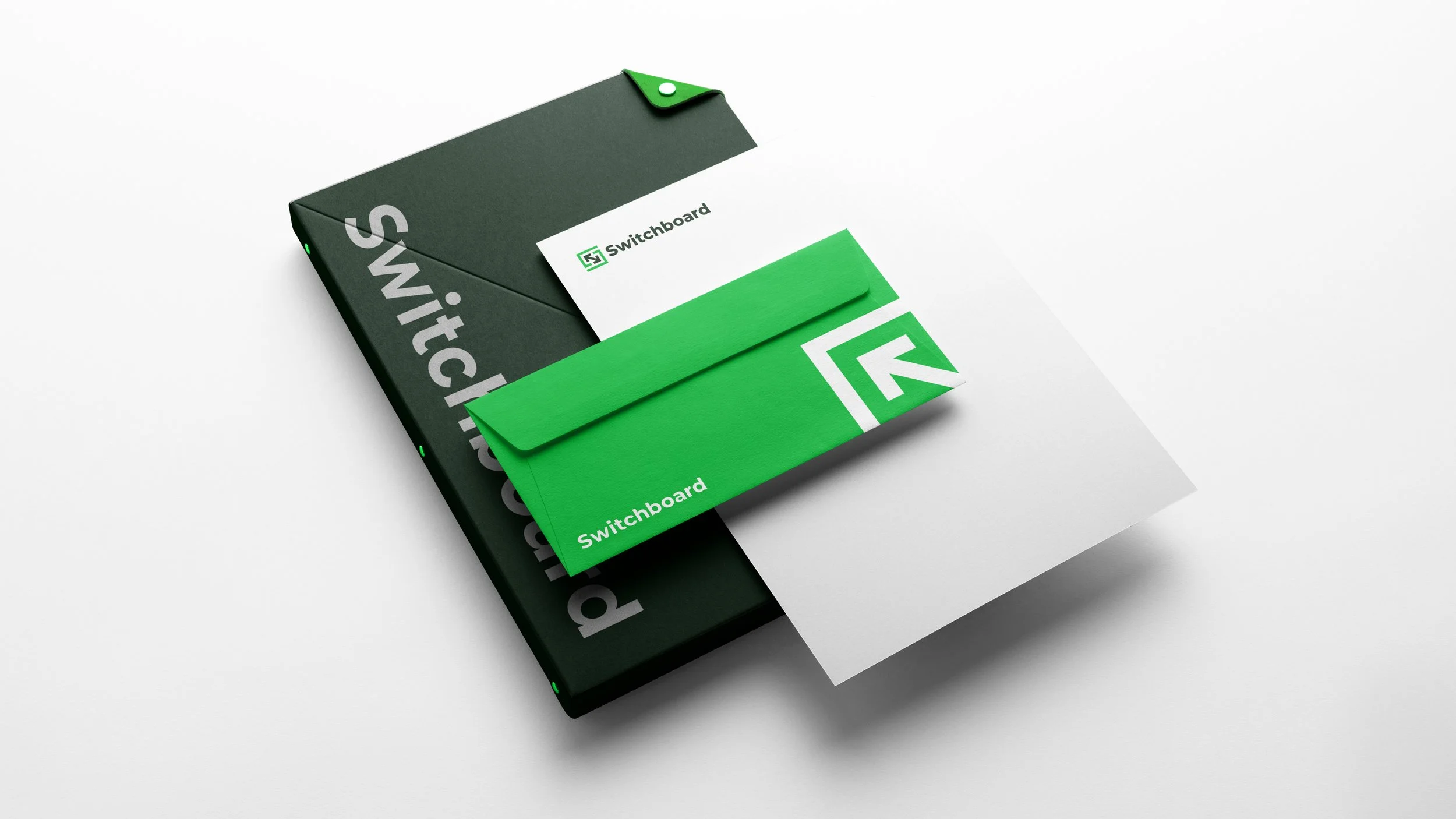
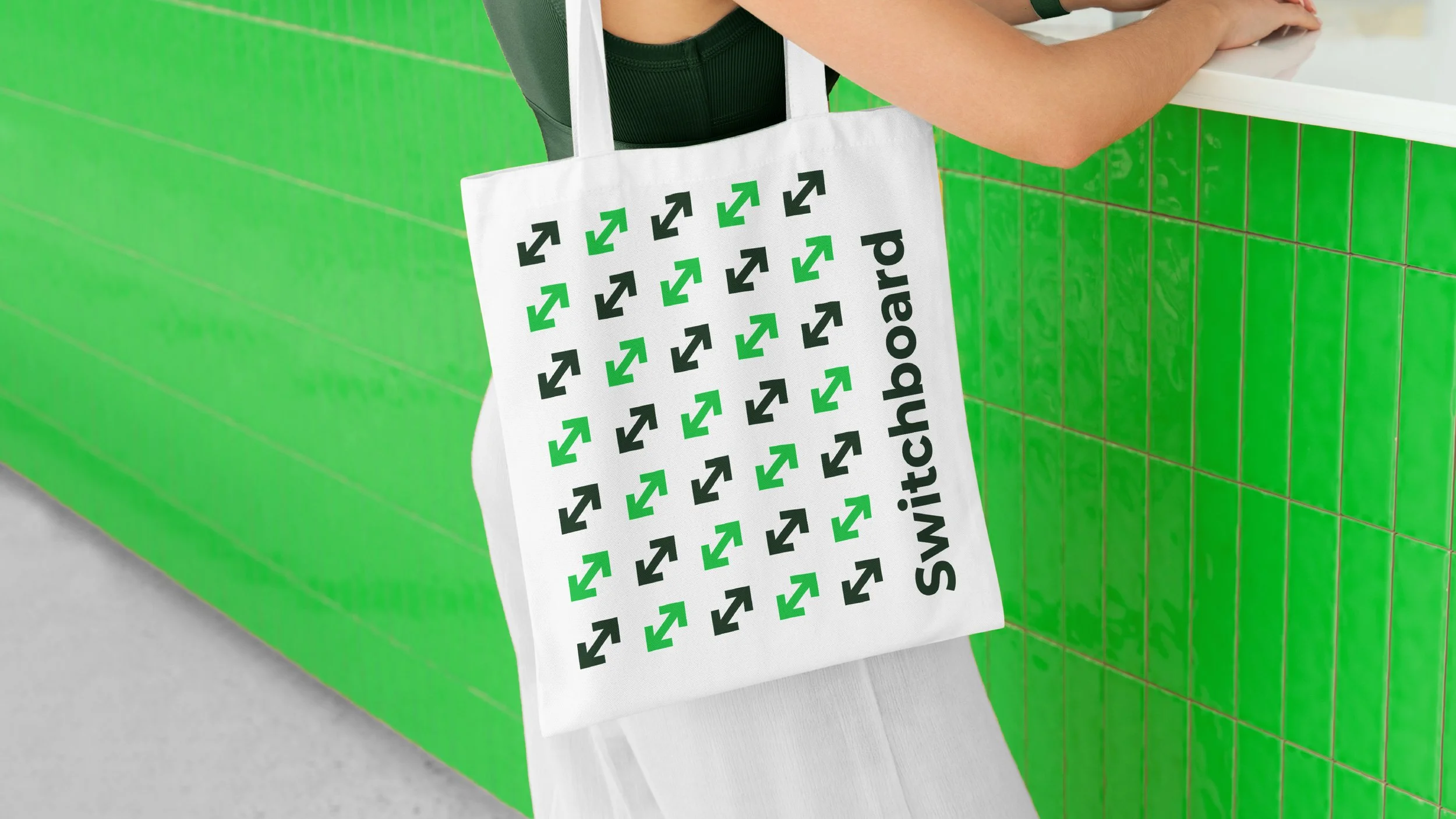
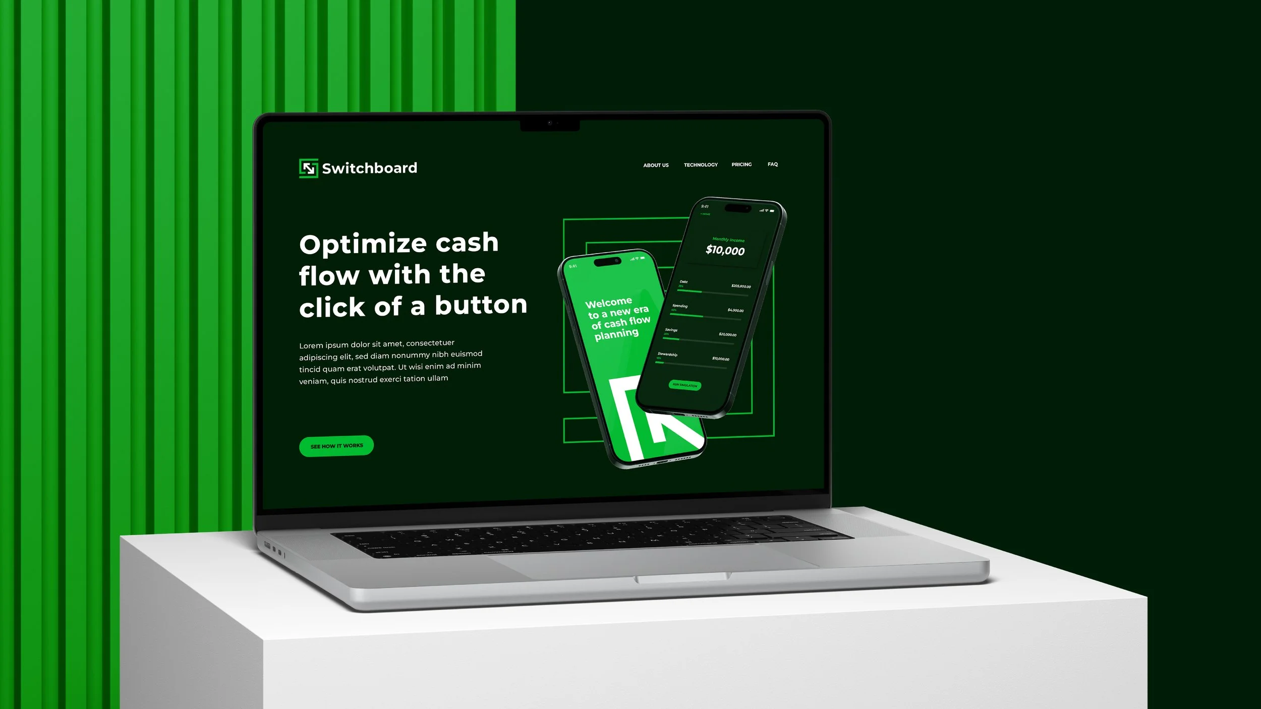
Once the mark was set, I expanded the system, designing key product screens and marketing materials to give Switchboard a cohesive, scalable identity. The result? A brand that’s as functional as it is refined, built to support their vision from day one.

