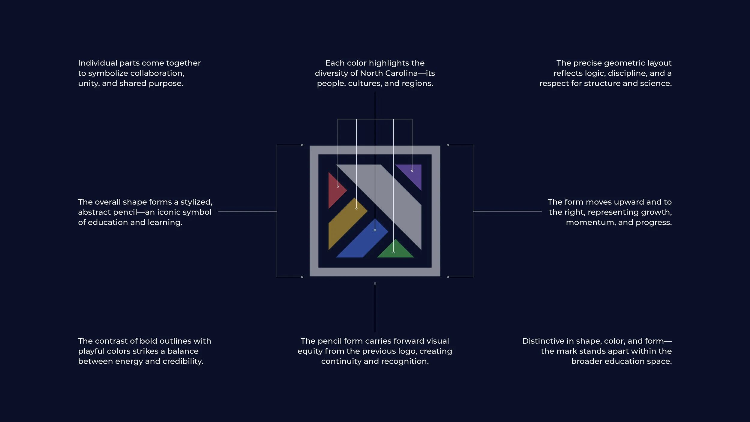
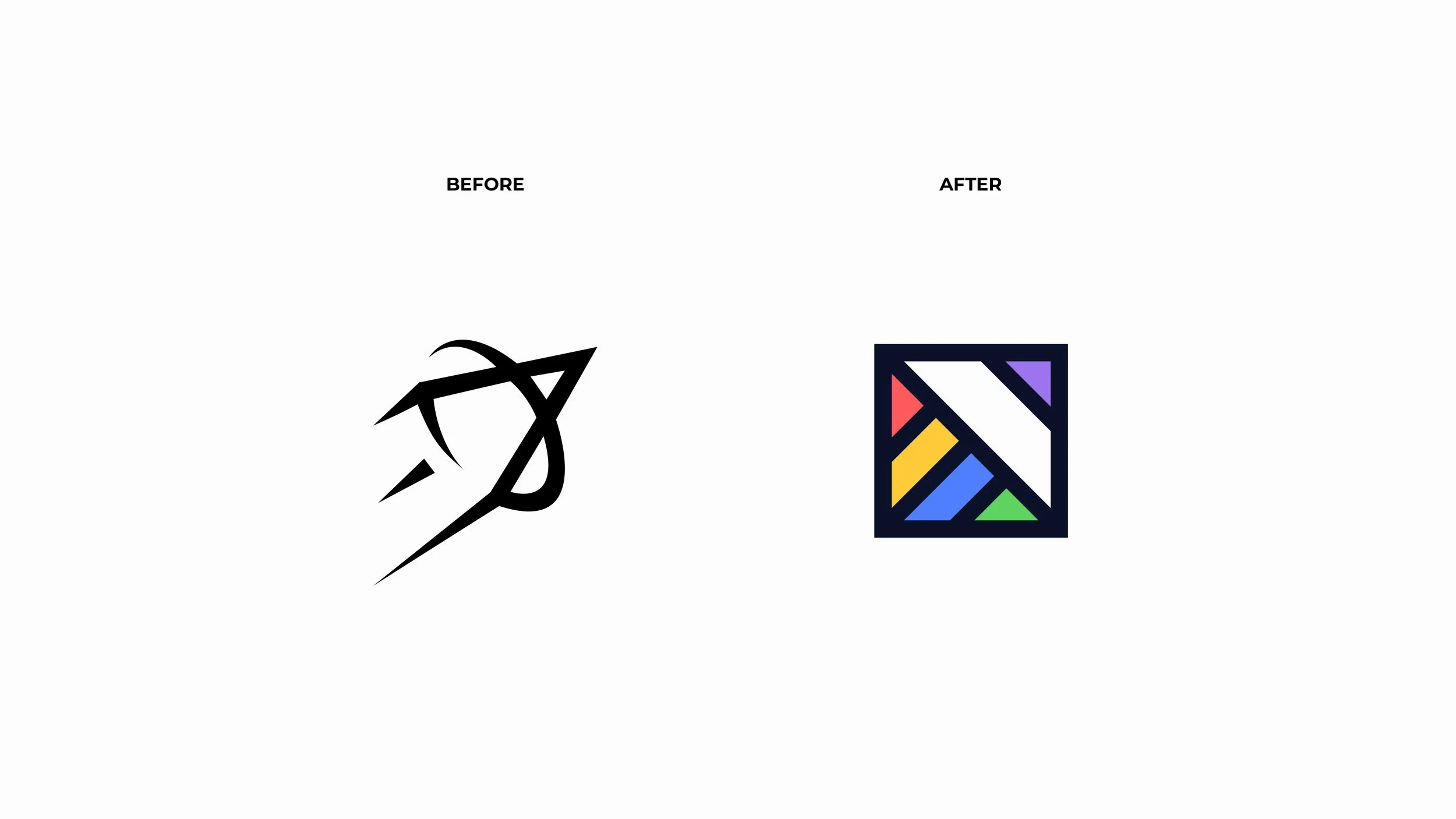
The Solution
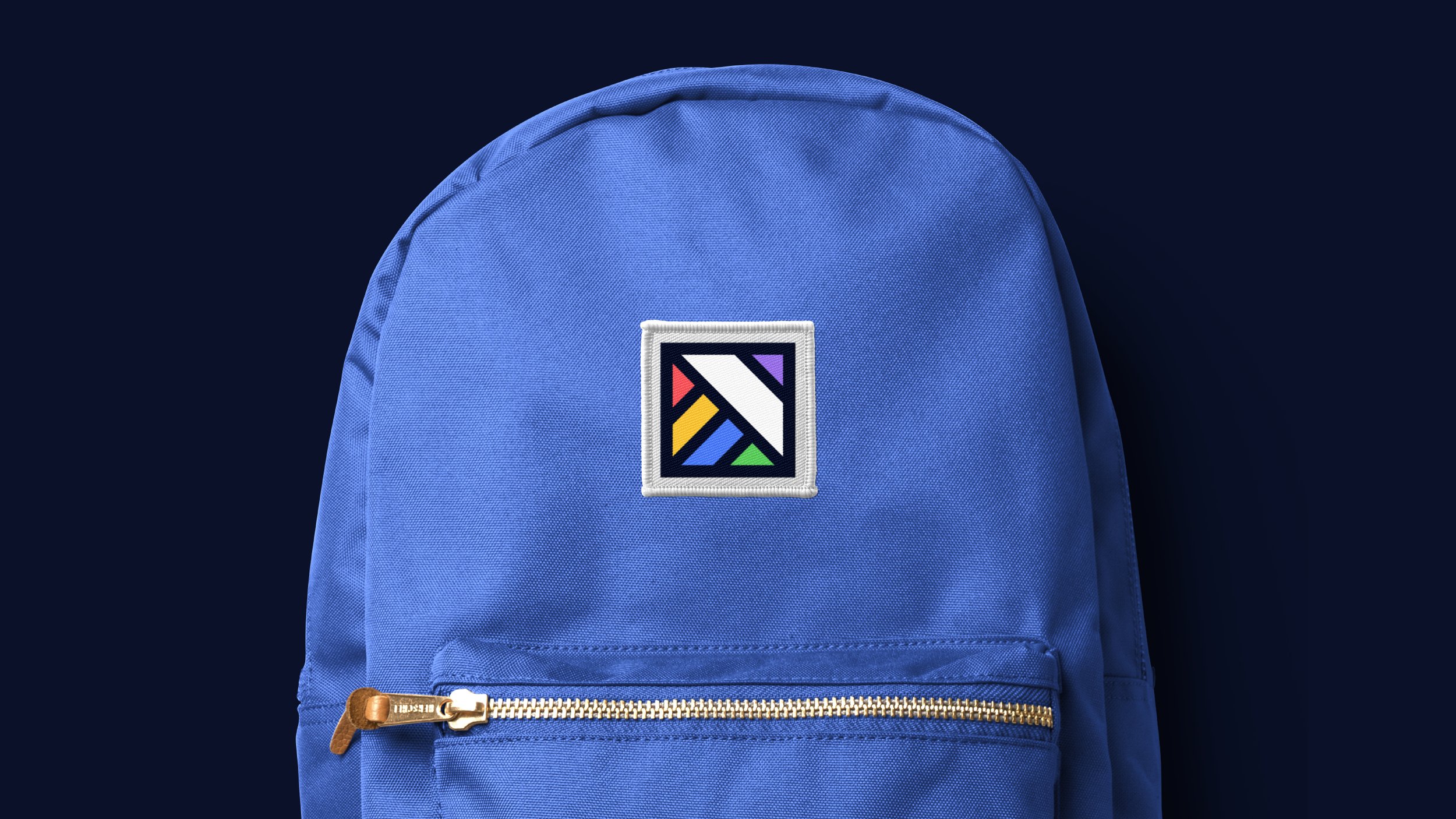
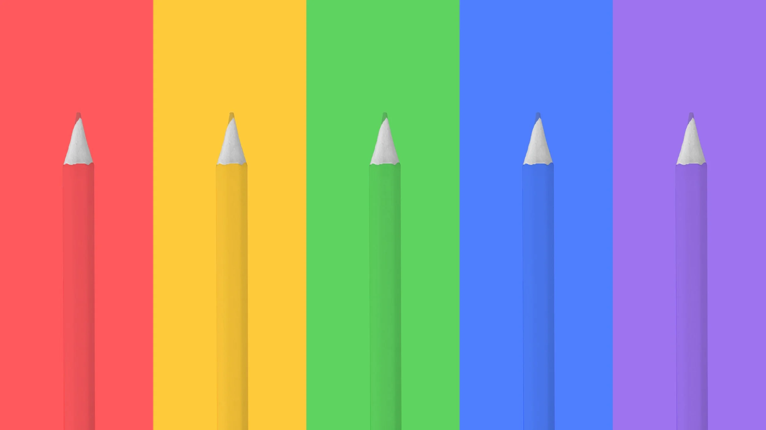
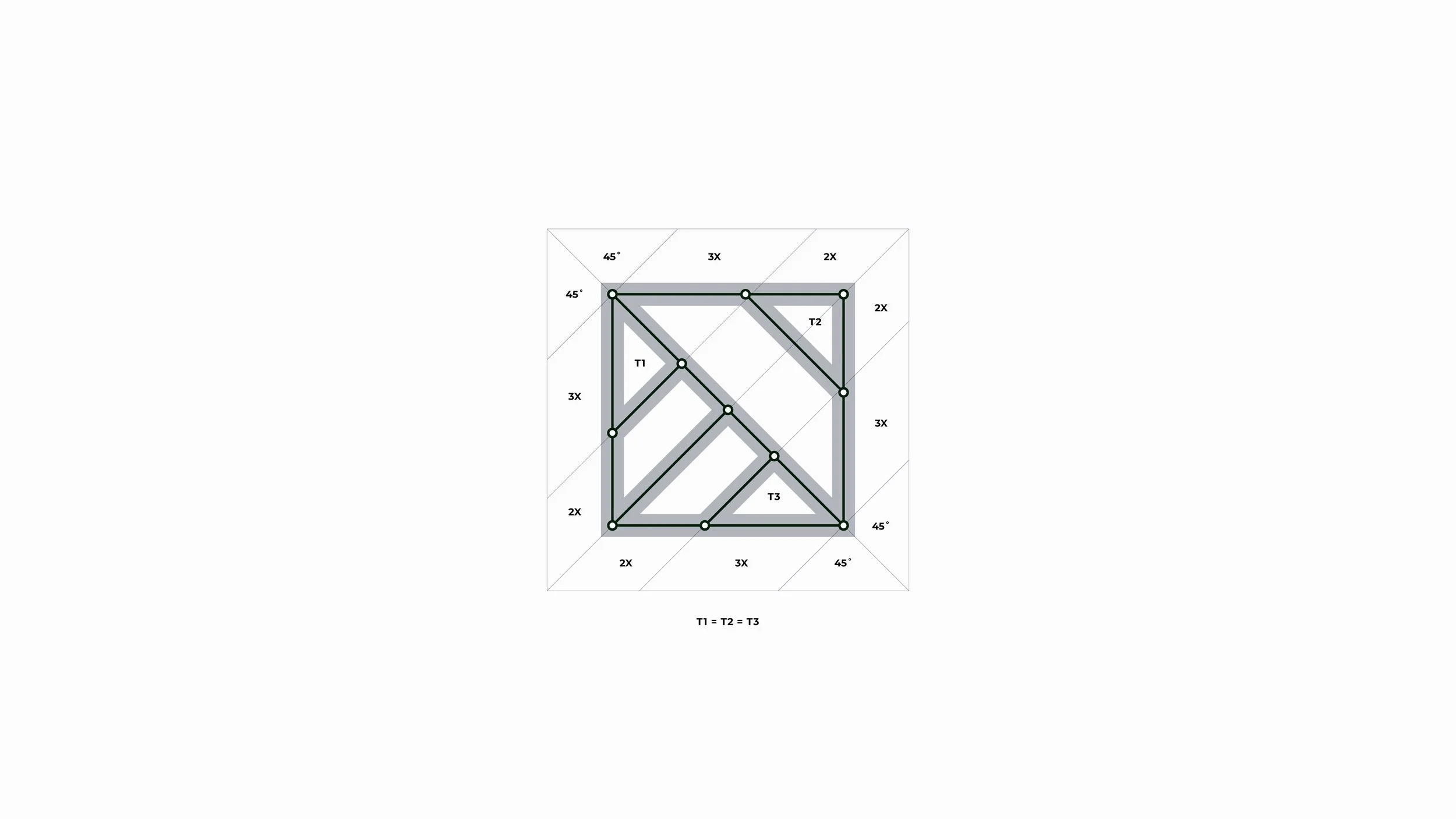
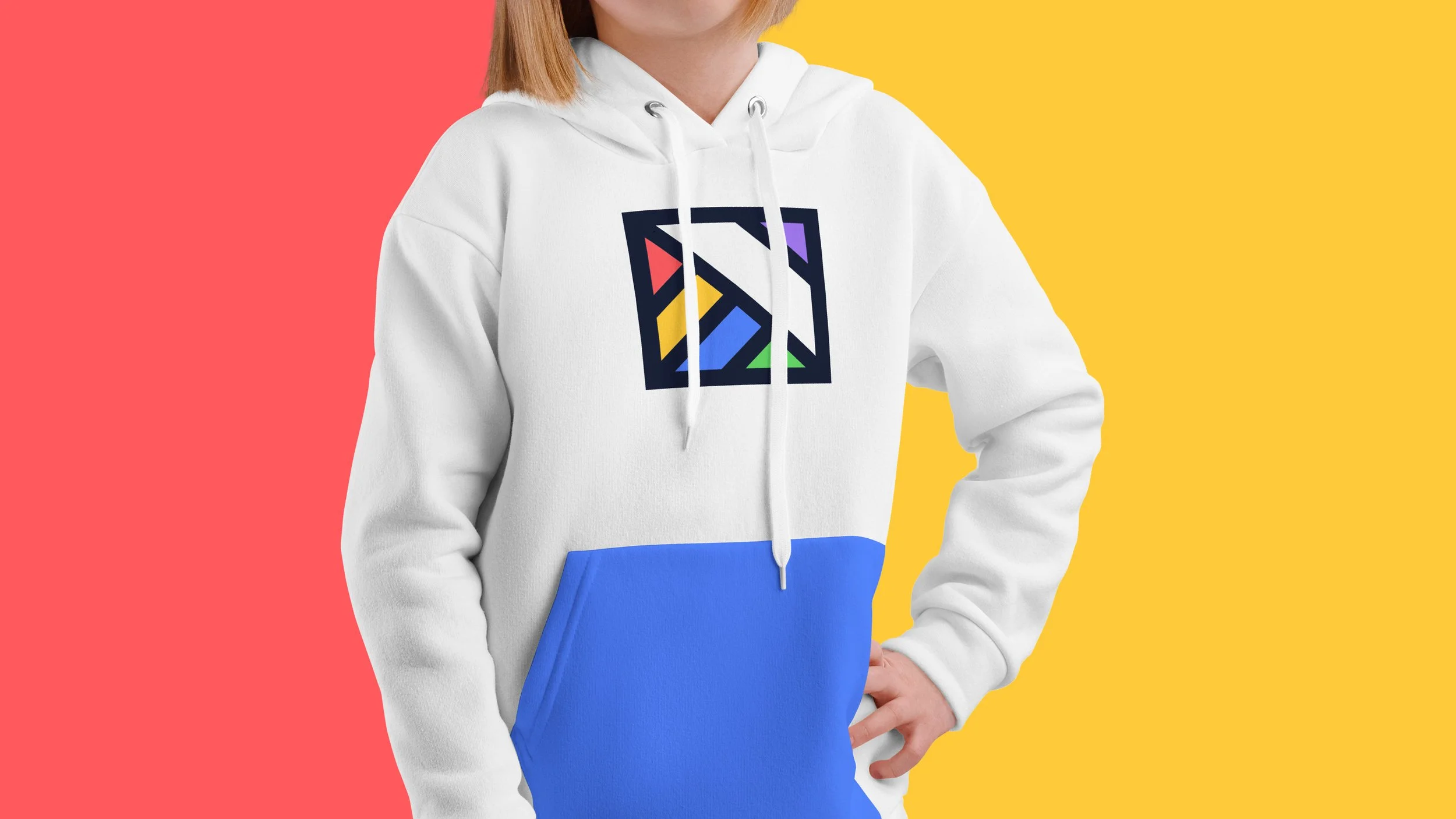
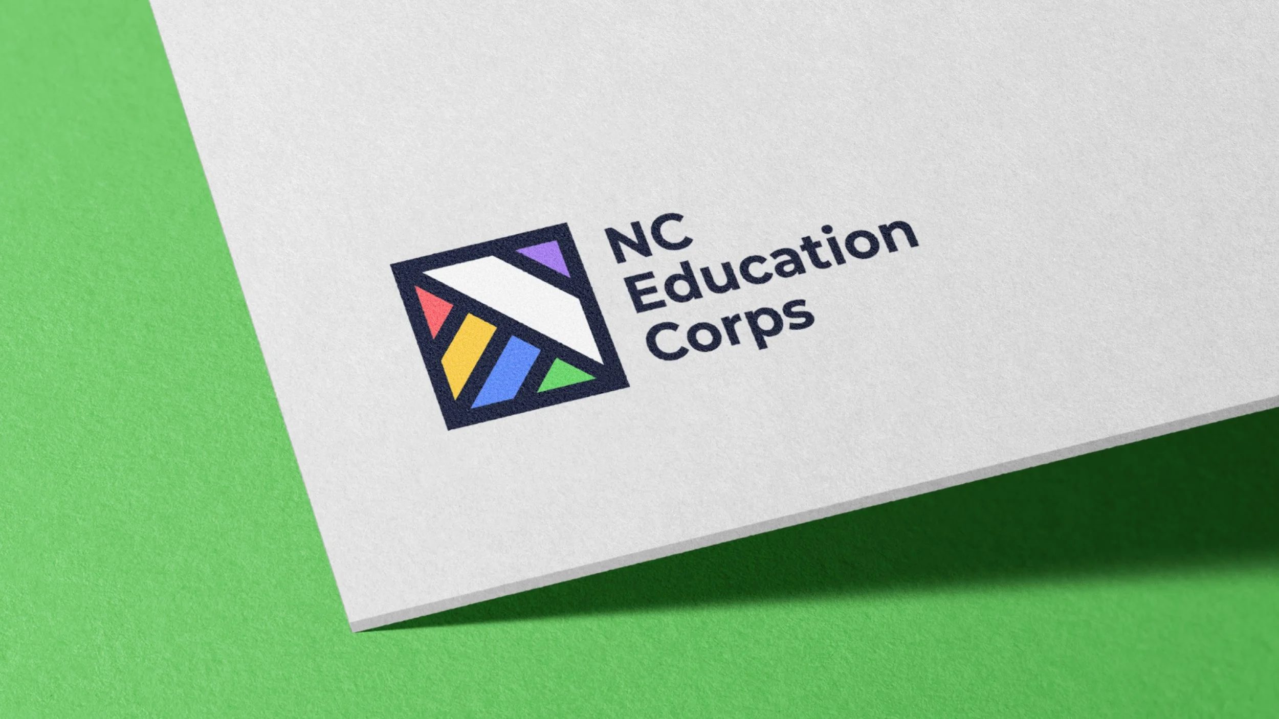
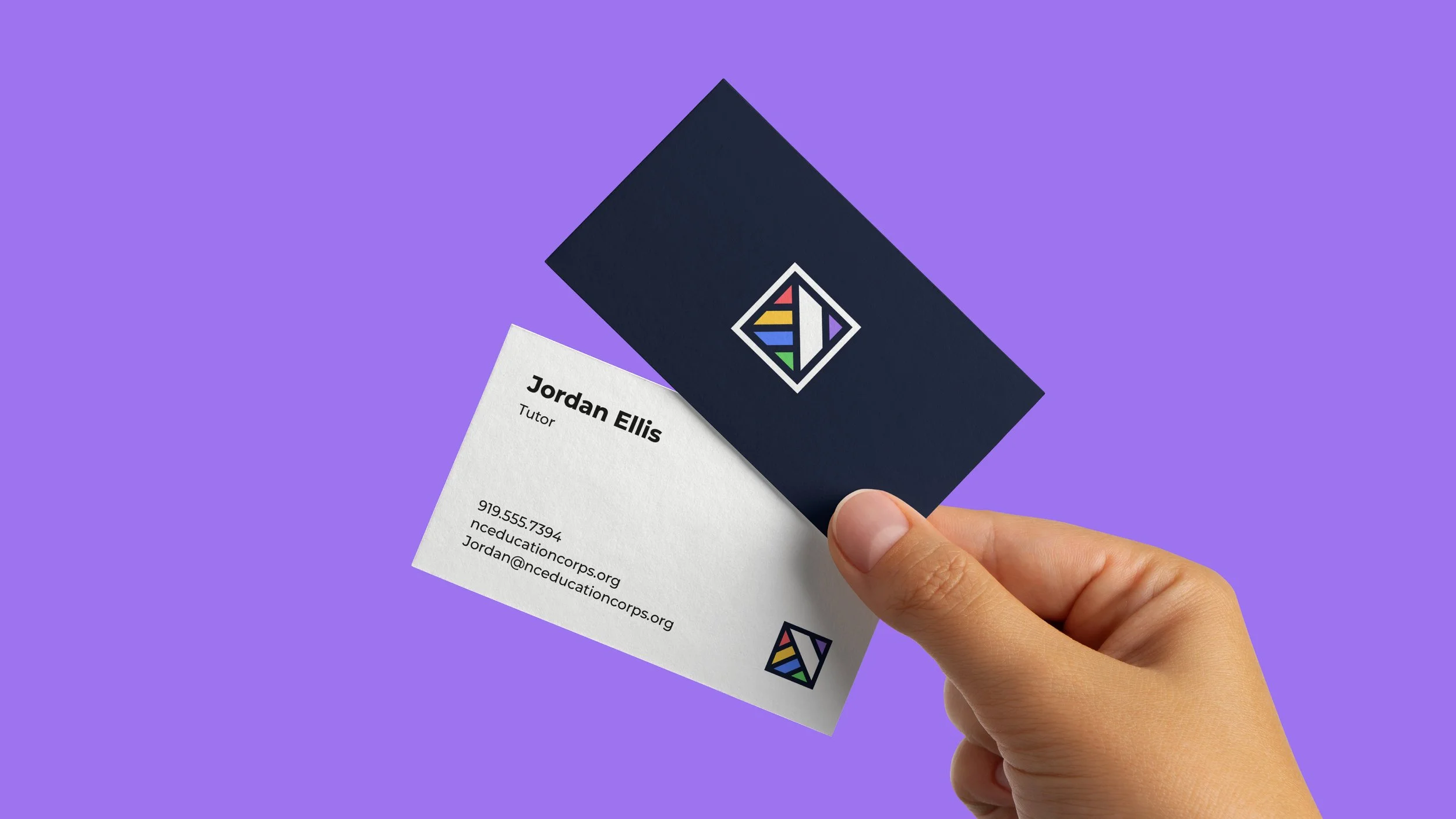
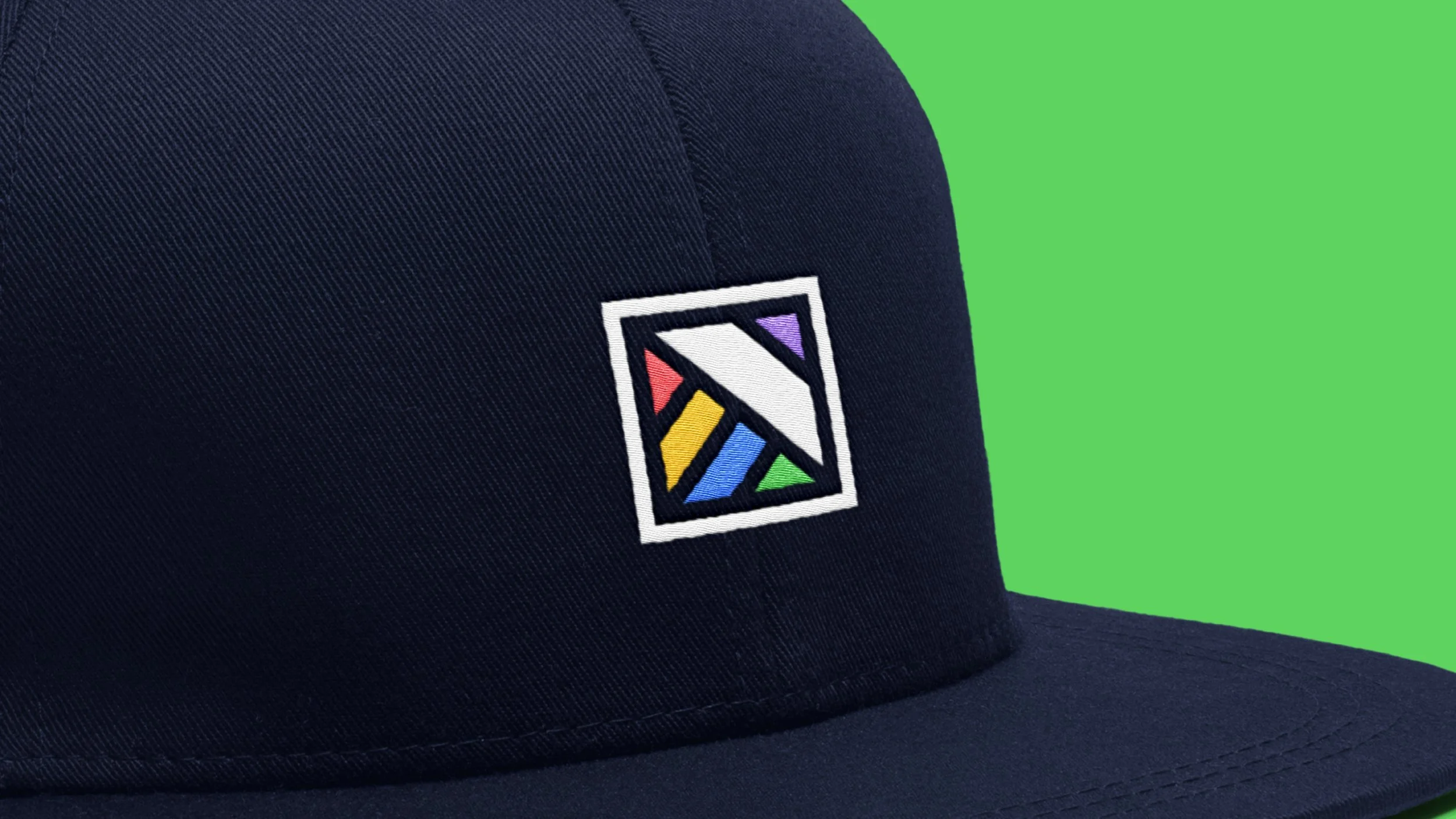
I took the pencil idea and reimagined it as something more vibrant and intentional. The final logo is a clear pencil form made from colorful geometric shapes, representing the many voices and identities working together to support student success. It’s simple, bold, and full of personality.
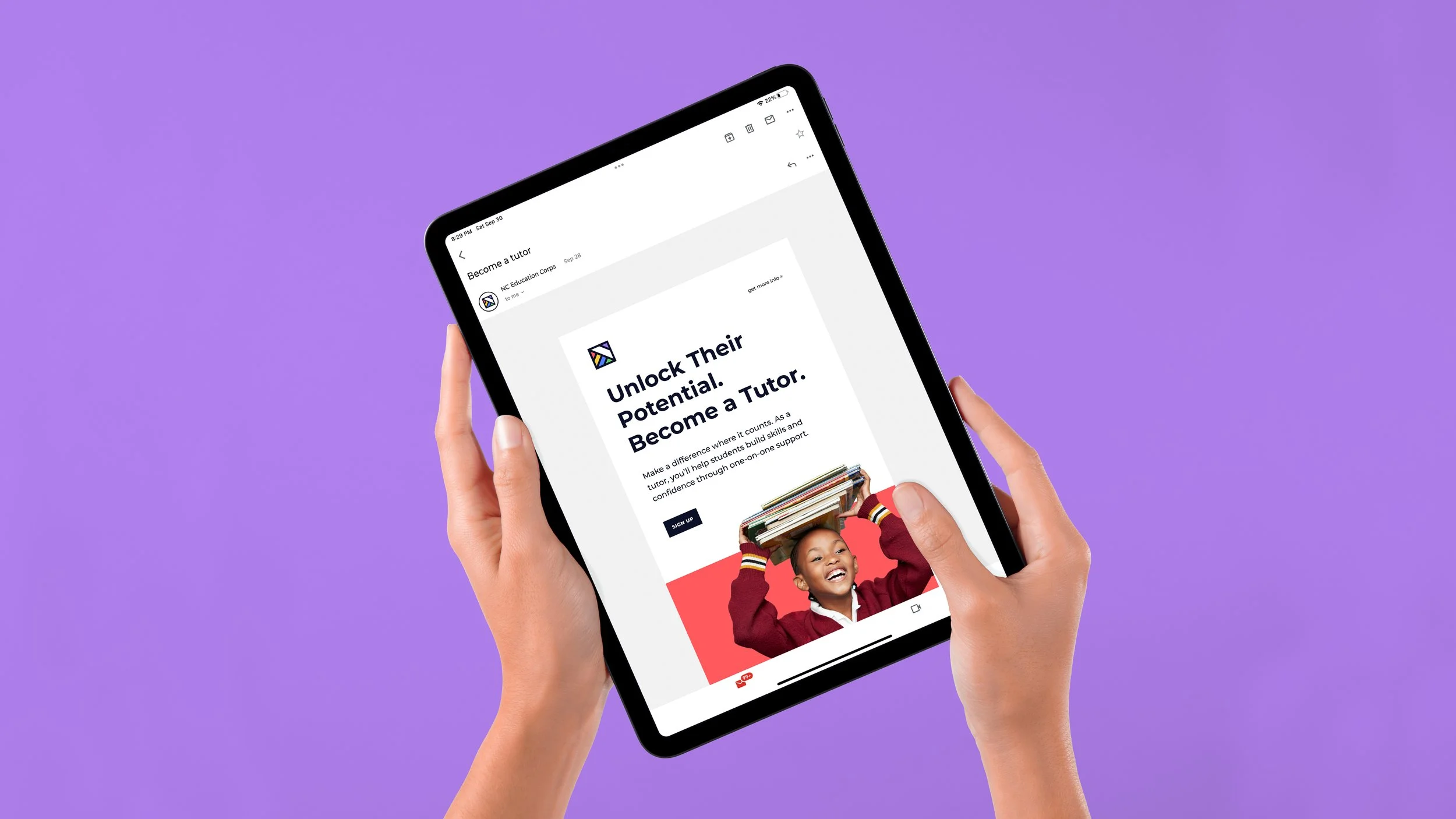
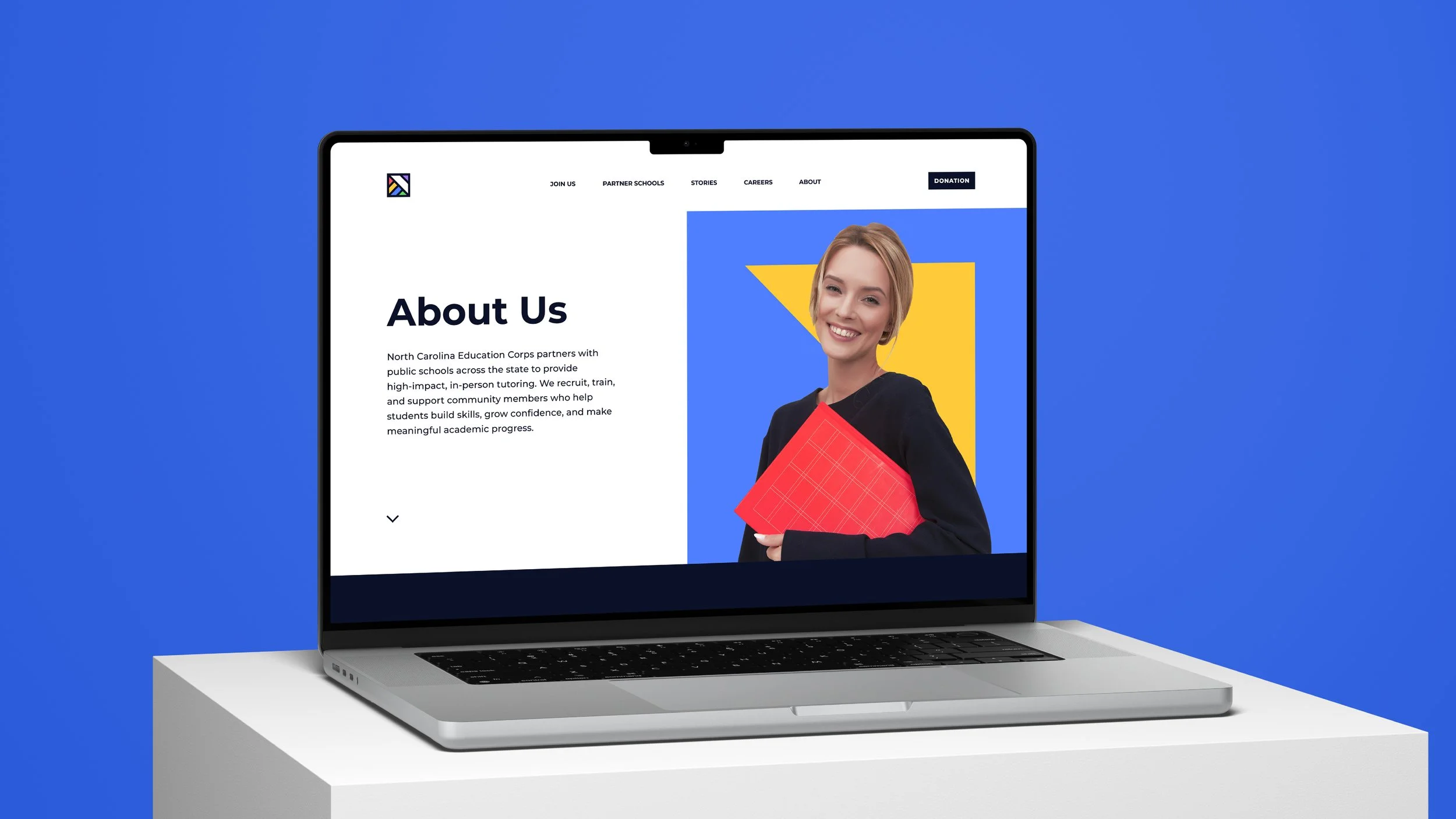
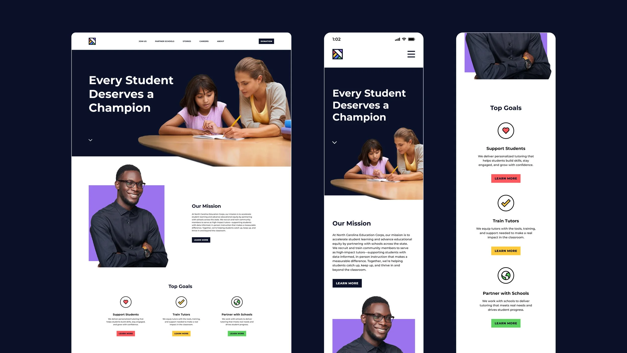
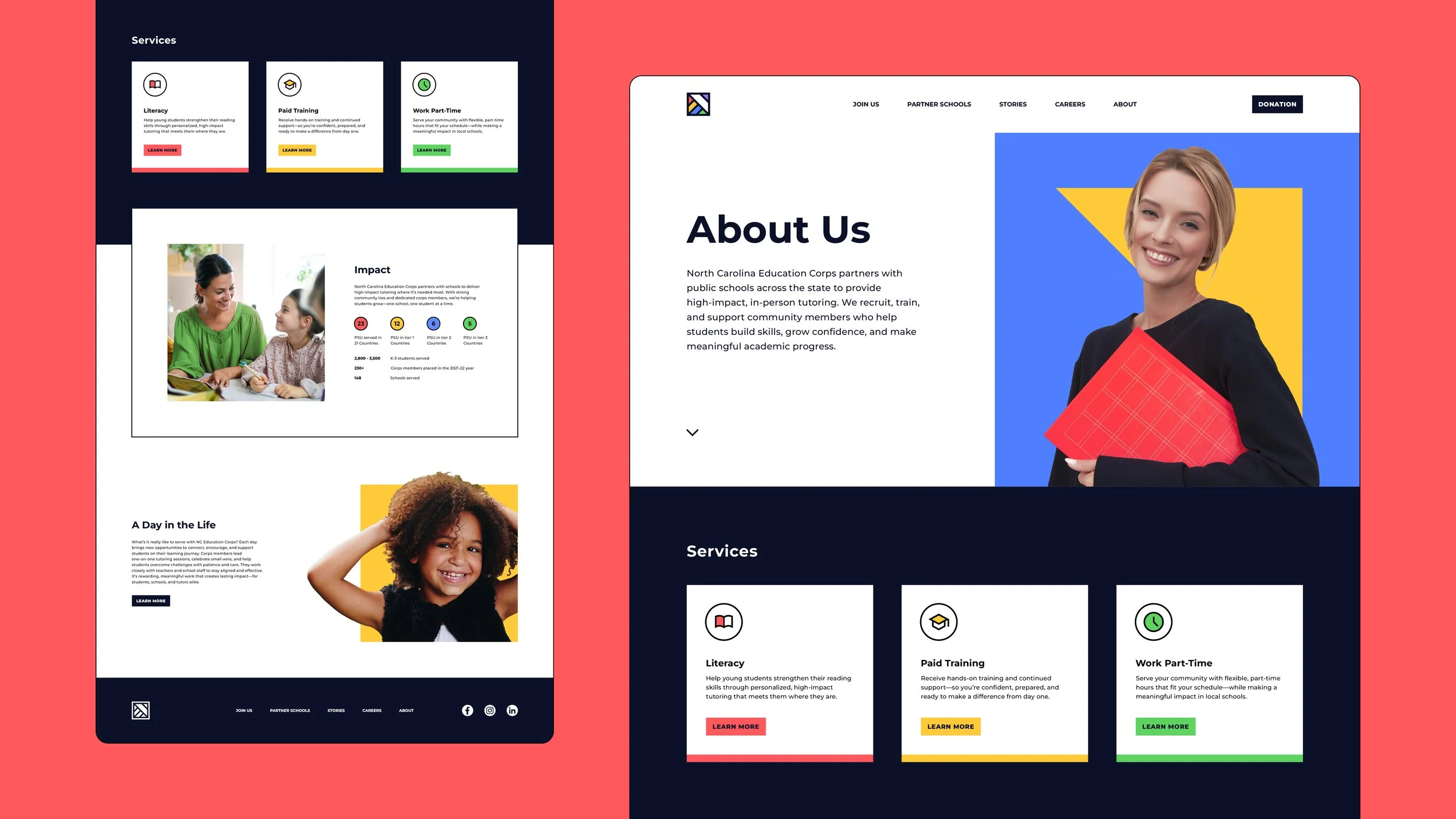
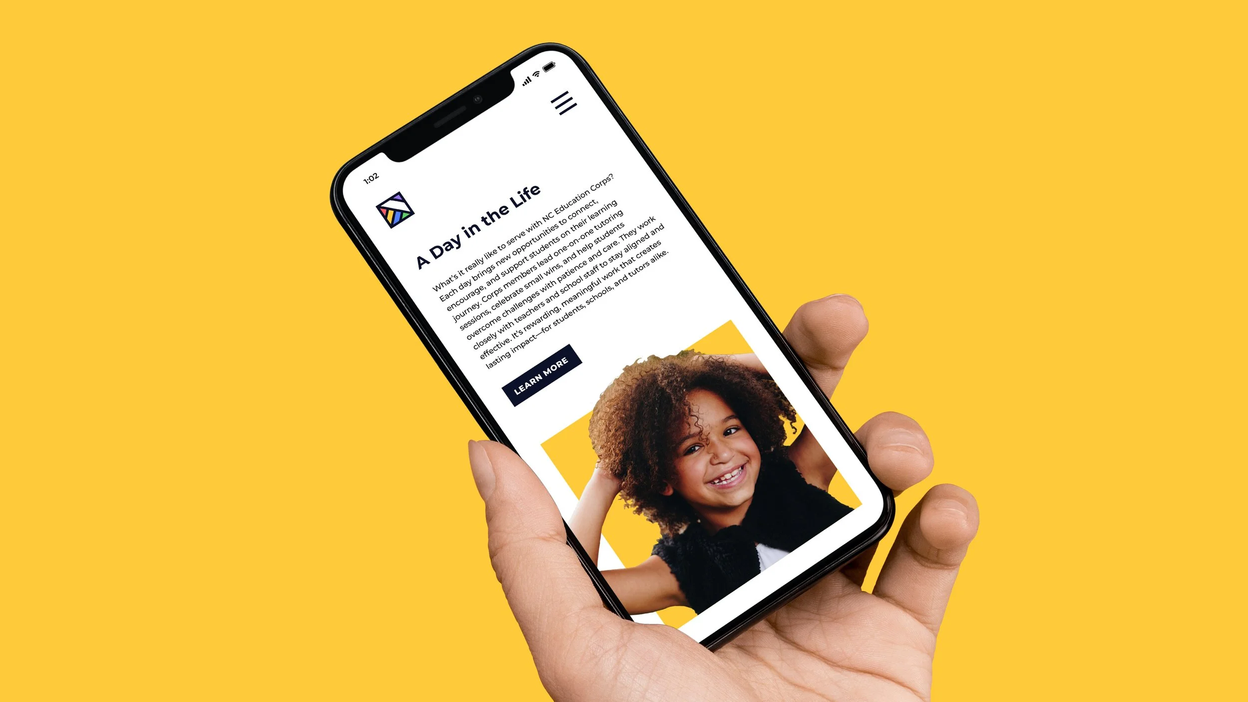
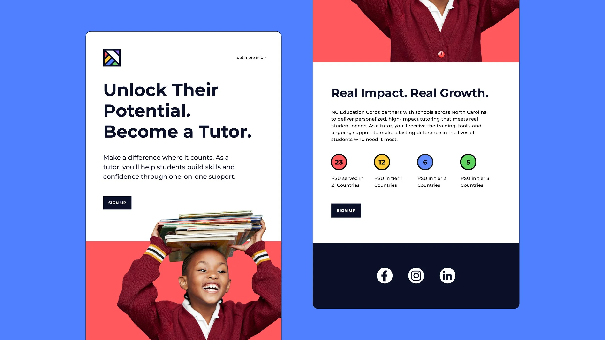
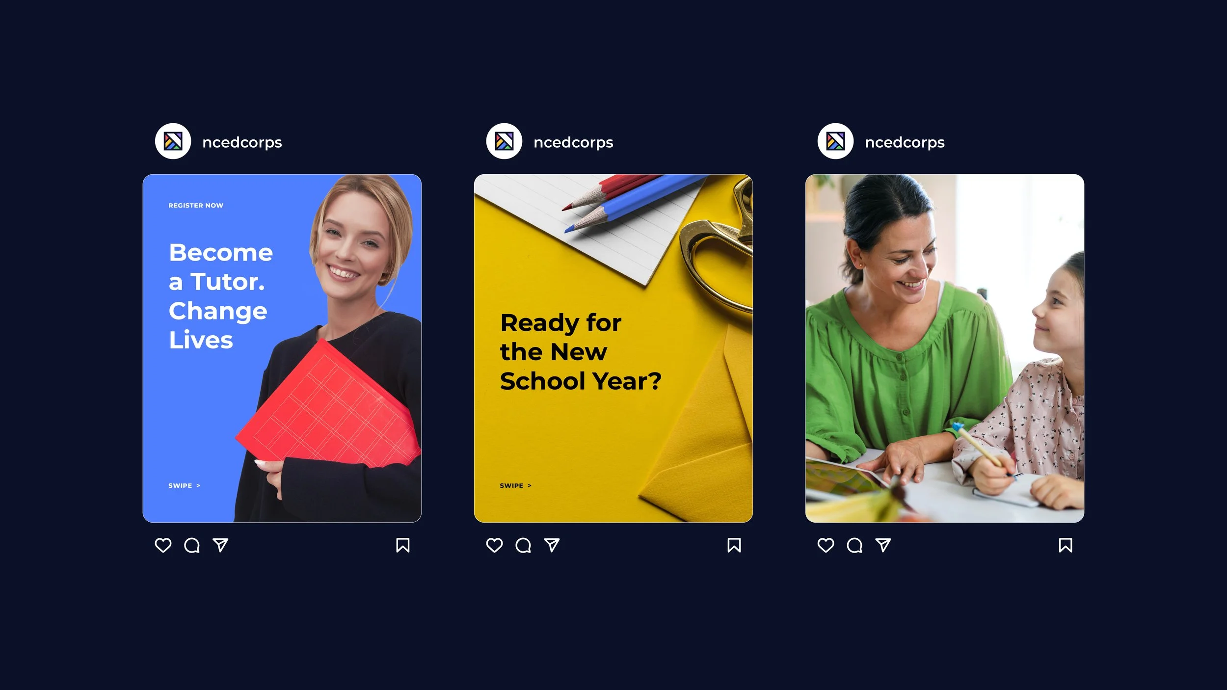
From there, I built out a playful brand system with bright colors, friendly typography, and flexible layouts that shine across web and print. The new identity feels alive—something people can rally around, whether they're applying to serve or supporting from afar.